Handling status bar color scheme and visibility in SwiftUI
Mar 14, 2023 ·
As we’ve previously looked at how to implement offset tracking and stretchable and sticky headers for SwiftUI scroll views, let’s look at how to handle status bar tint and visibility.
Previous work
The previous posts resulted in an open-source library called ScrollKit, which provides scroll view wrappers that makes it easy to handle things like offset tracking, sticky headers etc.
For instance, it makes it really easy to implement screens like the Spotify release screen:
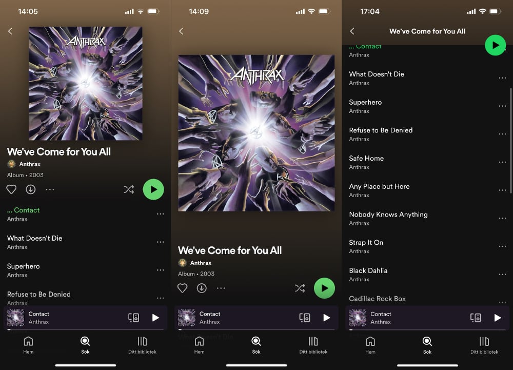
Although ScrollKit makes it easy to implement these sticky headers, one thing that is still a challenge is handling the status bar tint color.
Dark apps like Spotify can apply a light status bar style globally, but this is not true in apps that uses light mode and only want to apply a light status bar color for some screens.
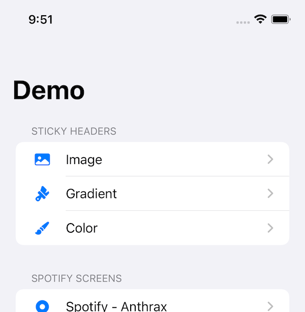
Consider an app that starts with a basic List that navigates to different demos. It uses the default status bar color, which means dark text in light mode and light text in dark mode:
If we tap the image link, we’re taken to a screen with a prominent image header that stretches out when pulled down and collapses to stick to the top when the list is scrolled:
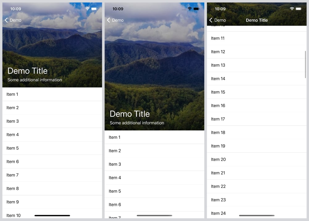
The screen uses .toolbarColorScheme(.dark, for: .navigationBar) to make the status and navigation bar text light. It also uses .toolbarBackground(.hidden) to hide the nav bar, since it has a sticky header that should replace the navigation view.
However, as you can see in the center image, the nav and status bar have dark text when the view is pulled down. In fact, it’s the default style that is applied before you scroll down, since the dark color scheme is only applied when the navigation bar fades in as you scroll.
This is a big problem, since we want this screen to use light text in the nav and status bar. Since I haven’t found a way around this, I instead looked into hiding the status bar, like the App Store does:

What I want to achieve, is to initially hide the status bar until the scroll view is scrolled. The status bar should then become visible until the scroll view is scrolled back to its starting position. The status bar should also not show when the scroll view is pulled down and the header stretched out.
Although this work resulted in finding more edge cases that I have yet to figure out how to solve, I think that I have something promising in the works. Let’s take a look at what it currently can do.
Hiding the status bar
To hide the status bar in SwiftUI, you can use the .statusBarHidden() view modifier, which takes a bool value to control whether or not the status bar should be hidden.
When I started playing around with this modifier with the sticky header we saw earlier, I noticed that it worked in some apps, but not in others.
For instance, this works:
struct ContentView: View {

    var body: some View {
        NavigationView {
            NavigationLink("Navigate") {
                Text("This works")
                    .statusBarHidden()
            }
        }
    }
}
while this doesn’t:
struct ContentView: View {

    var body: some View {
        NavigationStack {   // <-- Here we're using a NavigationStack instead
            NavigationLink("Navigate") {
                Text("This doesn't work")
                    .statusBarHidden()
            }
        }
    }
}
Turns out that a NavigationStack requires the .statusBarHidden modifier to be applied to the stack itself. This means that we have to use shared state to hide it from the child view:
struct ContentView: View {

    @State
    private var isStatusBarHidden = false

    var body: some View {
        NavigationStack {
            NavigationLink("Navigate") {
                Text("This works")
                    .onAppear {
                        withAnimation {
                            isStatusBarHidden = true
                        }
                    }
            }
        }
         .statusBarHidden(isStatusBarHidden)
    }
}
If we now navigate, the status bar fades out nicely, since we use withAnimation. However, if you then tap or swipe to go back, you’ll notice that the status bar is still hidden, since this code never updates the state when going back to the root view.
Given how inconsistent .onAppear and .onDisappear are, this shared state approach is quite a broken experience compared how we with the NavigationView can just apply the modifier to any child view. With shared state, we must make sure to set it properly when navigating, which is a hassle.
While I’m sure the NavigationStack behavior is a bug, we must play with the cards we’ve been dealt. I therefore started looking into if there is a way to streamline this experience using shared state in a more controlled way. If you do know another way to solve this with a NavigationStack, please let me know.
Implementing custom status bar tools
Since we obviously need to use shared state (please let me know if you know of another way), I think it would be nice to do so in a more convenient way than just passing around a boolean binding.
I therefore created this ObservableObject that is used to manage the visibility state, as well as a bool value to control if the transition between hidden and visible should be animated:
public class StatusBarVisibileState: ObservableObject {

    public init(
        isHidden: Bool = false,
        isAnimated: Bool = false
    ) {
        self.isHidden = isHidden
        self.isAnimated = isAnimated
    }

    @Published
    public var isHidden: Bool

    @Published
    public var isAnimated: Bool
}

public extension StatusBarVisibileState {

    func hide(if offset: CGPoint, ifGreaterThan value: CGFloat) {
        updateIsHidden(with: offset.y > value)
    }

    func hide(if offset: CGPoint, ifLessThan value: CGFloat) {
        updateIsHidden(with: offset.y < value)
    }

    func hideUntilPulled(using offset: CGPoint) {
        hide(if: offset, ifLessThan: 2)
    }

    func hideUntilScrolled(using offset: CGPoint) {
        hide(if: offset, ifGreaterThan: -3)
    }
}

private extension StatusBarVisibileState {

    func updateIsHidden(with value: Bool) {
        if isAnimated {
            withAnimation { isHidden = value }
        } else {
            isHidden = value
        }
    }
}

public extension View {

    func statusBarVisibile(_ state: StatusBarVisibileState) -> some View {
        self.statusBarHidden(state.isHidden)
            .environmentObject(state)
    }
}
We just have to create a @StateObject and apply it to a view with .statusBarVisibile(_):
struct ContentView: View {

    @StateObject
    private var state = StatusBarVisibileState()

    var body: some View {
        NavigationStack {
            ...
        }
        .statusBarVisible(state)
    }
}
This will apply .statusBar(hidden:) to the view and inject the state into the view hierarchy using an .environmentObject(_) view modifier.
This class also has a couple of utility function to update the visibility based on an offset. You may notice that I use pretty random numbers (-3 for scrolling and 2 for pulling), but these are the values that I found gave the best result. For instance, using -2 will show the status bar while it’s still using dark text.
Although we can now pass around this state or use @EnvironmentObject to access it within the view hierarchy, then update the isHidden state whenever we want to show or hide the status bar, we still have the problem that we must manually handle the state.
I therefore created another view modifier that lets us update the status bar visibility automatically by just applying a single view modifier to any view:
public struct StatusBarVisibilityUpdater: ViewModifier {

    public init(scrollOffset: Binding<CGPoint>) {
        _offset = scrollOffset
    }

    @Binding
    private var offset: CGPoint

    @Environment(\.presentationMode)
    private var presentationMode

    @EnvironmentObject
    private var state: StatusBarVisibileState

    public func body(content: Content) -> some View {
        content
            .onAppear {
                state.hideUntilScrolled(using: offset)
            }
            .onChange(of: offset) {
                state.hideUntilScrolled(using: $0)
            }
            .onChange(of: presentationMode.wrappedValue.isPresented) { _ in
                offset.y = 0
                state.isHidden = false
            }
    }
}

public extension View {

    func hideStatusBarUntilScrolled(using offset: Binding<CGPoint>) -> some View {
        self.modifier(StatusBarVisibilityUpdater(scrollOffset: offset))
    }
}
This modifier initializes the status bar visibility in the onAppear, then update the visibility whenever the provided offset binding changes. It then finally listens to presentationMode changes and resets the scroll visibility whenever and offset whenever it changes, to avoid hiding the status bar when navigating back to the parent view.
We can now apply our sticky header screen to use hideStatusBarUntilScrolled with the scroll offset that is retrieved from the ScrollViewWithStickyHeader whenever it scrolls:
struct DemoScreen<HeaderView: View>: View {

    let headerHeight: CGFloat

    @ViewBuilder
    let headerView: () -> HeaderView

    @State
    private var headerVisibleRatio: CGFloat = 1

    @State
    private var scrollOffset: CGPoint = .zero

    var body: some View {
        ScrollViewWithStickyHeader(
            header: header,
            headerHeight: headerHeight,
            onScroll: handleScrollOffset
        ) {
            listItems
        }
        .toolbar {
            ToolbarItem(placement: .principal) {
                Text("Demo Title")
                    .font(.headline)
                    .previewHeaderContent()
                    .opacity(1 - headerVisibleRatio)
            }
        }
        .toolbarBackground(.hidden)
        .toolbarColorScheme(.dark, for: .navigationBar)
        .hideStatusBarUntilScrolled(using: $scrollOffset)
    }

    func header() -> some View {
        ...
    }

    func handleScrollOffset(_ offset: CGPoint, headerVisibleRatio: CGFloat) {
        self.scrollOffset = offset
        self.headerVisibleRatio = headerVisibleRatio
    }
}
With this tiny change, the image header screen now automatically hides and shows the status bar as we scroll and pull down:
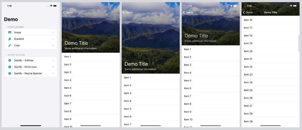
This also works when going back to the root view even when the status bar is hidden, at which the status bar becomes visible again. All in all, it’s a pretty clean solution to problems that we shouldn’t have in the first place.
Conclusion
Although, I’d prefer SwiftUI to always honor .toolbarColorScheme(.dark, for: .navigationBar) instead of only working when the navigation bar is faded in after scrolling down a few points, and to be able to apply statusBarHidden() to any view when using a NavigationStack, this approach works.
There is currently still som work to be done when pushing another screen to the navigation stack from a sticky header view, at which going back to the sticky header view will show the navigation bar even if the view isn’t scrolled. If you have any ideas, please let me know.
I have added the view modifier to my ScrollKit library. If you give it a try, I’d love to hear what you think.
Discussions & More
If you found this interesting, please share your thoughts on Bluesky and Mastodon. Make sure to follow to be notified when new content is published.