Adding a stretchable header to a SwiftUI ScrollView
Feb 5, 2023 ·
Many iOS apps have screens where the header view stretches out when you pull down the screen. In this post, let’s look at how to implement such a header view in SwiftUI.
Example
If you are unsure of what kind of view I mean, consider this nice Spotify album screen:
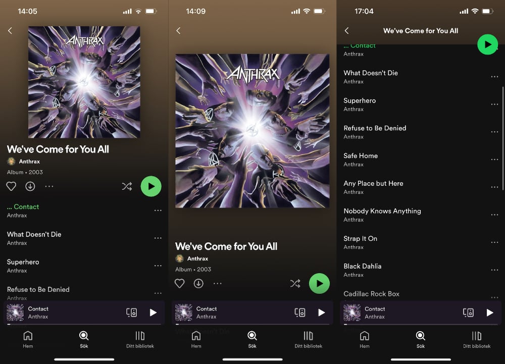
As you can see, the header stretches out when you pull it down, instead of leaving a gap at the top, then scrolls away with the rest of the content with a nice fade animation.
How to implement a stretchable scroll view header
Turns out that building a stretchable scroll view header is actually pretty simple, and only requires you to use a GeometryReader and apply a frame and offset to your content view.
We need to define how the view should behave when it’s in its original position and how it should resize when we pull it down. We also have to make it ignore the top safe area.
Let’s first wrap our content in a GeometryReader so that we can use its proxy to get the size and frame of the content:
GeometryReader { geo in
    content()
        .stretchable(in: geo)
}
Let’s then define a view extension that we can use to transform the content into a header:
private extension View {

    @ViewBuilder
    func stretchable(in geo: GeometryProxy) -> some View {
        if geo.frame(in: .global).minY <= 0 {
            // When the view is being scrolled
        } else {
            // When the view is resting or being pulled
        }
    }
}
When the view is being scrolled, we actually just want to use the original view. This means that the first part of the if clause can be expressed like this:
private extension View {

    @ViewBuilder
    func stretchable(in geo: GeometryProxy) -> some View {
        if geo.frame(in: .global).minY <= 0 {
            self
        } else {
            // Set up the view's pulled down behavior
        }
    }
}
When the view is pulled down, we want to resize it to cover for the additional space, which is the minY position of the geometry proxy, then offset it with the same inverted amount, to get the effect that it sticks to the top and expands at the bottom.
This lets us fill out the second part of the if clause and wrap up the feature altogether:
extension View {

    @ViewBuilder
    func stretchable(in geo: GeometryProxy) -> some View {
        let width = geo.size.width
        let height = geo.size.height
        let minY = geo.frame(in: .global).minY
        let useStandard = minY <= 0
        self.frame(width: width, height: height + (useStandard ? 0 : minY))
            .offset(y: useStandard ? 0 : -minY)
    }
}
We just add the proxy minY to the view height and adjust the vertical offset with the same amount. This will account for the safe area, which means we don’t have to do it separately.
This is actually all we have to do to create a stretchable scroll view header. Put it topmost in a scroll view, and it will automatically expand when you pull down on it.
Creating a new scroll view header component
Since we must always use a GeometryReader and a view modifier for this to work, I find it convenient to have a separate scroll view header view that does all of this:
public struct ScrollViewHeader<Content: View>: View {

    public init(
        @ViewBuilder content: @escaping () -> Content
    ) {
        self.content = content
    }

    private let content: () -> Content

    public var body: some View {
        GeometryReader { geo in
            content().stretchable(in: geo)
        }
    }
}

private extension View {

    @ViewBuilder
    func stretchable(in geo: GeometryProxy) -> some View {
        let width = geo.size.width
        let height = geo.size.height
        let minY = geo.frame(in: .global).minY
        let useStandard = minY <= 0
        self.frame(width: width, height: height + (useStandard ? 0 : minY))
            .offset(y: useStandard ? 0 : -minY)
    }
}
You can now use a ScrollViewHeader instead of having to add a GeometryReader to the scroll view and apply a view modifier to the scroll view content.
Implementing the album screen
Let’s put this header view to the test by implementing a test screen that mimics the Spotify album screen we saw at the beginning of this post.
The screen should use dark mode and have a header that fades from brown to black. The header should be stretchable and have a cover that expands when it’s pulled down.
Let’s start with defining the screen:
struct AlbumScreen: View {

    var body: some View {
        NavigationView {
            ScrollView {
                header
                content
            }
        }
        .accentColor(.white)
        .colorScheme(.dark)
    }
}
The header view is a ScrollViewHeader with a gradient background and an AsyncImage that fetches the image from a remote url:
var header: some View {
    ScrollViewHeader {
        ZStack {
            LinearGradient(
                colors: [.brown, .black],
                startPoint: .top,
                endPoint: .bottom
            )
            AsyncImage(
                url: URL(string: "https://upload.wikimedia.org/wikipedia/en/8/8f/AnthraxWCFYA.jpg"),
                content: { image in
                    image.image?.resizable()
                        .aspectRatio(contentMode: .fit)
                }
            )
            .aspectRatio(1, contentMode: .fit)
            .cornerRadius(5)
            .shadow(radius: 10)
            .padding(.top, 60)
            .padding(.horizontal, 20)
        }
    }
    .frame(height: 280)
}
We also apply a fixed height to the header, and specifies native constraints to the image, to make sure that it’s a rounded square with a a drop shadow and some edge padding.
The content view is just a VStack with some padding and the rest of the scrollable content:
var content: some View {
    VStack(spacing: 20) {
        title
        buttons
        list
    }
    .padding()
}
The title view is just a VStack with some stylized text:
var title: some View {
    VStack(alignment: .leading, spacing: 8) {
        Text("We've Come for You All")
            .font(.title2.bold())
            .frame(maxWidth: .infinity, alignment: .leading)
        Text("Anthrax")
            .font(.footnote.bold())
        Text("Album · 2003")
            .font(.footnote.bold())
            .foregroundColor(.secondary)
    }
}
The buttons view is just an HStack with some icons:
var buttons: some View {
    HStack(spacing: 15) {
        Image(systemName: "heart")
        Image(systemName: "arrow.down.circle")
        Image(systemName: "ellipsis")
        Spacer()
        Image(systemName: "shuffle")
        Image(systemName: "play.circle.fill")
            .font(.largeTitle)
            .foregroundColor(.green)
    }
    .font(.title3)
}
And finally, the list view is just a LazyVStack with some dummy items:
var list: some View {
    LazyVStack(alignment: .leading, spacing: 30) {
        listItem("Contact")
        listItem("What Doesn't Die")
        listItem("Superhero")
        listItem("Refuse to Be Denied")
        listItem("Safe Home")
        listItem("Any Place But Here")
        listItem("Nobody Knows Anything")
    }
}

func listItem(_ song: String) -> some View {
    VStack(alignment: .leading) {
        Text(song).font(.headline)
        Text("Anthrax")
            .font(.footnote)
            .foregroundColor(.secondary)
    }
}
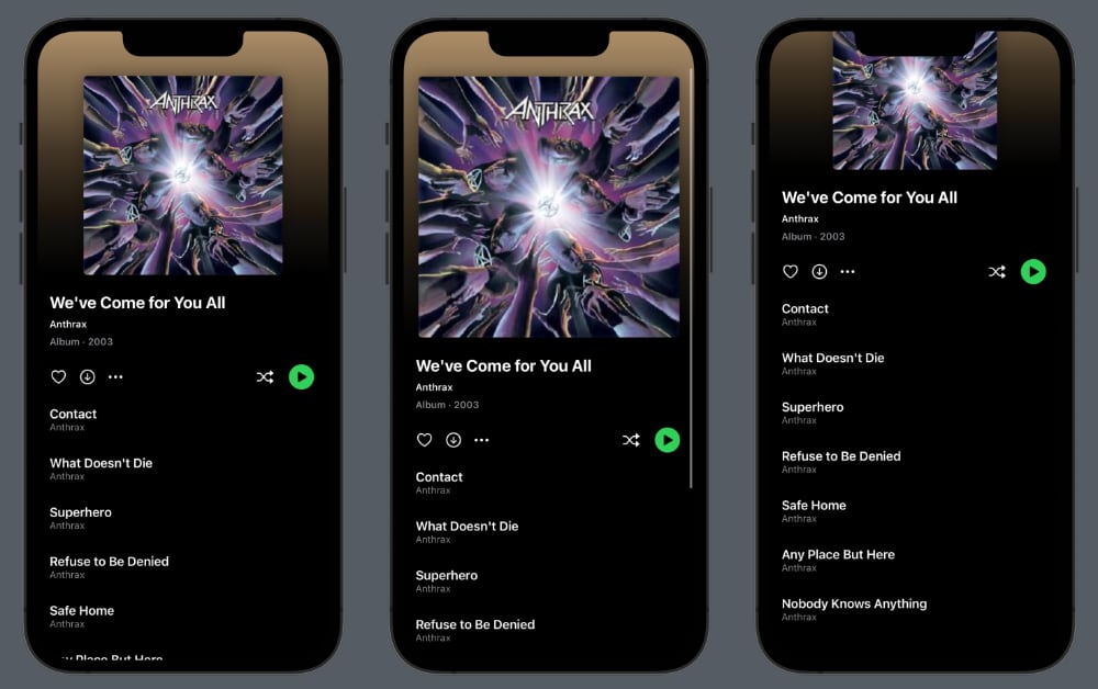
Put all this together and you get a screen that looks like the Spotify album screen, where the header stretches out when you pull down, then scrolls with the rest of the content:
Although this is already nice, there are some things you must consider when creating this kind of header, since it doesn’t play well together with the standard navigation view.
Things to consider
When you use this kind of stretchable header together with a native NavigationView, there are a few things that you should consider.
First, don’t use .navigationBarTitleDisplayMode(.large) since it adds a large title. You can instead cross fade from a custom header to an inline title when the header scrolls away.
You should also consider using toolbarBackground(.hidden) or a UIKit workaround on iOS versions before iOS 16, to make the navigation bar transparent while the header is visible.
The Spotify app will actually make the header stick to the top when it reaches the size of the navigation bar. I will show you how to build this in an upcoming post.
Finally, make sure to set up the status bar and navigation title to play well with the header. You can use the scroll offset to determine how to style the header.
Conclusion
The ScrollViewHeader presented in this post lets you add stretchable headers to a scroll view by just adding your content to this header component.
I have added this view to my newly released ScrollKit library. You can find the source code here. If you give it a try, I’d love to hear what you think.
Big thanks to Daniel Arden for joining my efforts to extend the native SwiftUI ScrollView with these great features.
Discussions & More
If you found this interesting, please share your thoughts on Bluesky and Mastodon. Make sure to follow to be notified when new content is published.