Adding a sticky header to a SwiftUI ScrollView
Feb 9, 2023 ·
As we’ve previously looked at how to implement offset tracking and stretchable headers for SwiftUI scroll views, let’s combine them to implement a stretchy, sticky scroll view header.
Example
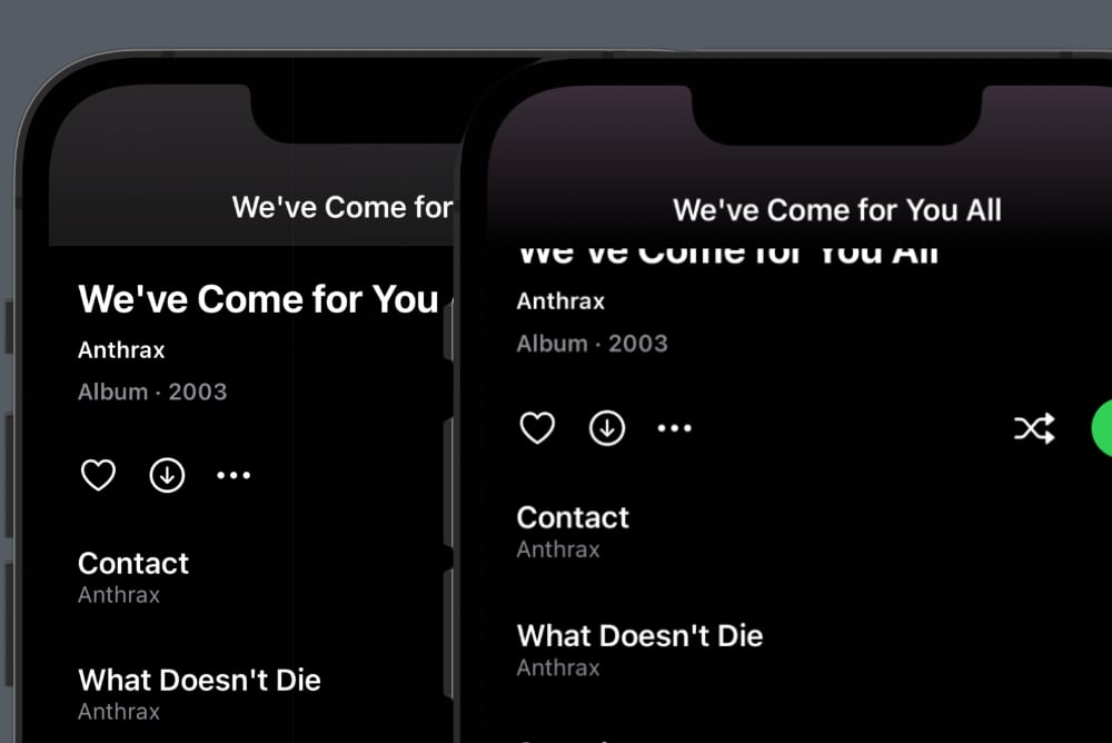
If you are unsure of what kind of view I mean, consider this nice Spotify album screen:
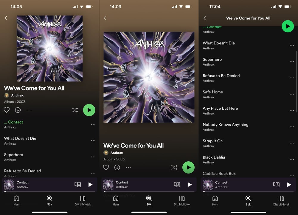
The header stretches out when you pull it down, instead of leaving a gap at the top, then scrolls away with the rest of the content with a nice fade animation and parallax effect.
This is a commonly used and loved kind of component, which strangely isn’t available as a native UIKit or SwiftUI component.
To recreate this, we have to be detect the scroll offset, then make the header stretch out when it’s pulled down and stick to the top as it scrolls past the navigation bar.
How to implement scroll offset tracking
We need to detect the scroll offset to be able to stick the header to the top and adjust it as it scrolls. For instance, Spotify scales and fades out the cover and fades in the screen title.
As we saw here, we can detect it by using a preference key and a coordinate namespace. By adding a tiny layer on top of a native ScrollView, the post’s ScrollViewWithOffset will continuously provide us with an updated scroll offset as its content scrolls.
How to implement a stretchable scroll view header
We need to find a way to make the scroll view header stretch out when we pull it down. It would also be nice to make the cover scale up when we do, as the Spotify app does.
As we saw here, it’s actually pretty easy to implement this kind of header by using a plain GeometryReader to read the frame, then applying a frame & offset to the header content to make it stretch out downwards.
We can use the post’s ScrollViewHeader with the ScrollViewWithOffset to get both offset tracking and a strechable header.
How to make the scroll view header sticky
We can build upon the ScrollViewWithOffset and ScrollViewHeader and add a little more code to make the header sticky.
Let’s create a new ScrollViewWithStickyHeader view that wraps a ScrollViewWithOffset view and stores the provided scroll offset for future use:
public struct ScrollViewWithStickyHeader<Content: View>: View {

    public init(
        _ axes: Axis.Set = .vertical,
        showsIndicators: Bool = true,
        onScroll: ScrollAction? = nil,
        @ViewBuilder content: @escaping () -> Content
    ) {
        self.axes = axes
        self.showsIndicators = showsIndicators
        self.onScroll = onScroll
        self.content = content
    }

    private let axes: Axis.Set
    private let showsIndicators: Bool
    private let onScroll: ScrollAction?
    private let content: () -> Content

    public typealias ScrollAction = (_ offset: CGPoint) -> Void

    @State
    private var scrollOffset: CGPoint = .zero

    @State
    private var navigationBarHeight: CGPoint = .zero

    public var body: some View {
        scrollView
    }
}

private extension ScrollViewWithStickyHeader {

    var scrollView: some View {
        ScrollViewWithOffset(onScroll: handleScrollOffset) {
            content()
        }
    }

    func handleScrollOffset(_ offset: CGPoint) {
        self.scrollOffset = offset
        self.onScroll?(offset, headerVisibleRatio)
    }
}
Here, we just duplicate most of the ScrollViewWithOffset properties and pass them into the wrapped scroll view. We will however make changes to this as we go along.
We will for instance need the navigation bar height to detect when the header is scrolled past it. We can get this by wrapping the scroll view in a GeometryReader and read its top safeAreaInsets:
private extension ScrollViewWithStickyHeader {

    var scrollView: some View {
        GeometryReader { proxy in
            ScrollViewWithOffset(onScroll: handleScrollOffset) {
                content()
            }
            .onAppear {
                DispatchQueue.main.async {
                    navigationBarHeight = proxy.safeAreaInsets.top
                }
            }
        }
    }
}
We now have the scrollOffset and navigationBarHeight. Let’s now add a custom header builder and header height to the view.
To support a custom header view, we must add a generic Header condition. We can add init parameters and view properies to inject a header view builder and a headerHeight:
public struct ScrollViewWithStickyHeader<Header: View, Content: View>: View {

    public init(
        _ axes: Axis.Set = .vertical,
        @ViewBuilder header: @escaping () -> Header,
        headerHeight: CGFloat,
        headerMinHeight: CGFloat? = nil,
        showsIndicators: Bool = true,
        onScroll: ScrollAction? = nil,
        @ViewBuilder content: @escaping () -> Content
    ) {
        self.axes = axes
        self.showsIndicators = showsIndicators
        self.header = header
        self.headerHeight = headerHeight
        self.headerMinHeight = headerMinHeight
        self.onScroll = onScroll
        self.content = content
    }

    private let axes: Axis.Set
    private let showsIndicators: Bool
    private let header: () -> Header
    private let headerHeight: CGFloat
    private let headerMinHeight: CGFloat?
    private let onScroll: ScrollAction?
    private let content: () -> Content

    ...
}
We can now adjust the scrollView to add the header topmost in a VStack with 0 spacing:
var scrollHeader: some View {
    ScrollViewHeader(content: header)
        .frame(height: headerHeight)
}

var scrollView: some View {
    GeometryReader { proxy in
        ScrollViewWithOffset(onScroll: handleScrollOffset) {
            VStack(spacing: 0) {
                scrollHeader
                content()
            }
        }
        ...
    }
}
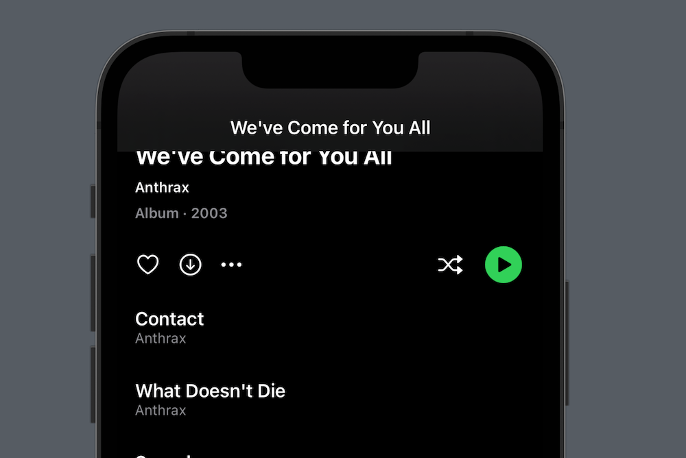
If we’d stop now, we would have a pretty nice scroll view with a stretchy header. It would however scroll away with the content, which is not what a user may expect.
If you consider the Spotify screen we saw above, that screen would currently look like this:
To make the header stick to the top, we must detect when it has scrolled past the navbar. We can calculate this using the navigationBarHeight and headerHeight:
private var headerVisibleRatio: CGFloat {
    max(0, (headerHeight + scrollOffset.y) / headerHeight)
}
Since the header view is added topmost in the scroll view and scrollOffset.y decreases as we scroll, we can add the offset to the headerHeight to get the number of visible points.
If we divide this with the headerHeight and limit it to zero, we get a visibility ratio that starts at 1 (the header is visible), then decrease to 0 as the header is scrolled past the navbar.
As a fun bonus, the value becomes greater than 1 when you pull down. This can be used for cool pull down effects.
The header is considered visible as long as it’s not fully covered by the navbar. When it becomes fully hidden, we should detach it from the scroll view to not scroll it further.
We can not remove the header without affecting the position of the rest of the content, but we actually don’t need to. We can just add a second header when the visible ratio is 0:
public struct ScrollViewWithStickyHeader<Header: View, Content: View>: View {

    ...

    public var body: some View {
        ZStack(alignment: .top) {
            scrollView
            navbarOverlay
        }
    }
}

private extension ScrollViewWithStickyHeader {

    @ViewBuilder
    var navbarOverlay: some View {
        if headerVisibleRatio <= 0 {
            Color.clear
                .frame(height: navigationBarHeight)
                .overlay(scrollHeader, alignment: .bottom)
                .ignoresSafeArea(edges: .top)
        }
    }
}
Here, we wrap the scroll view in a ZStack and overlays it with a view that bottom aligns a second scroll view header over a clear color once the headerVisibleRatio becomes 0.
If we compare the old result to the left with the new result to the right, you will see something strange:
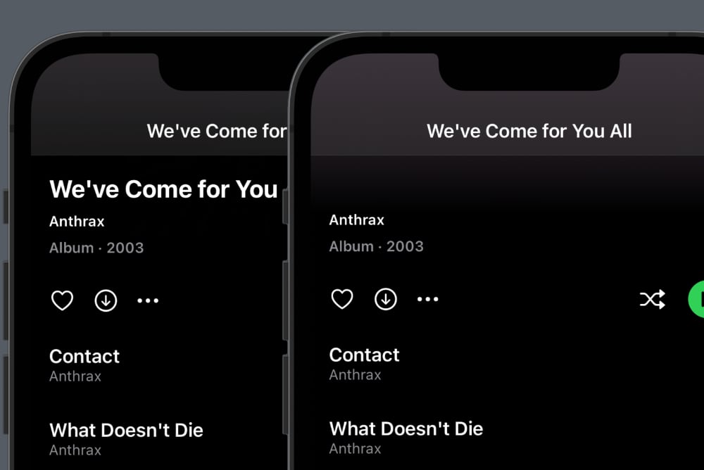
The right scrolled title is cut off too soon, which means that the additional header actually added but becomes too tall. Also, the navigation bar should be transparent.
The reason why the additional header becomes too tall is that we are using the default navigation bar title display mode, which is .large. Let’s change this to .inline:
public struct ScrollViewWithStickyHeader<Header: View, Content: View>: View {

    ...

    public var body: some View {
        ZStack(alignment: .top) {
            scrollView
            navbarOverlay
                .ignoresSafeArea(edges: .top)
                .frame(minHeight: headerMinHeight)
        }
        #if os(iOS)
        .navigationBarTitleDisplayMode(.inline)
        #endif
    }
}
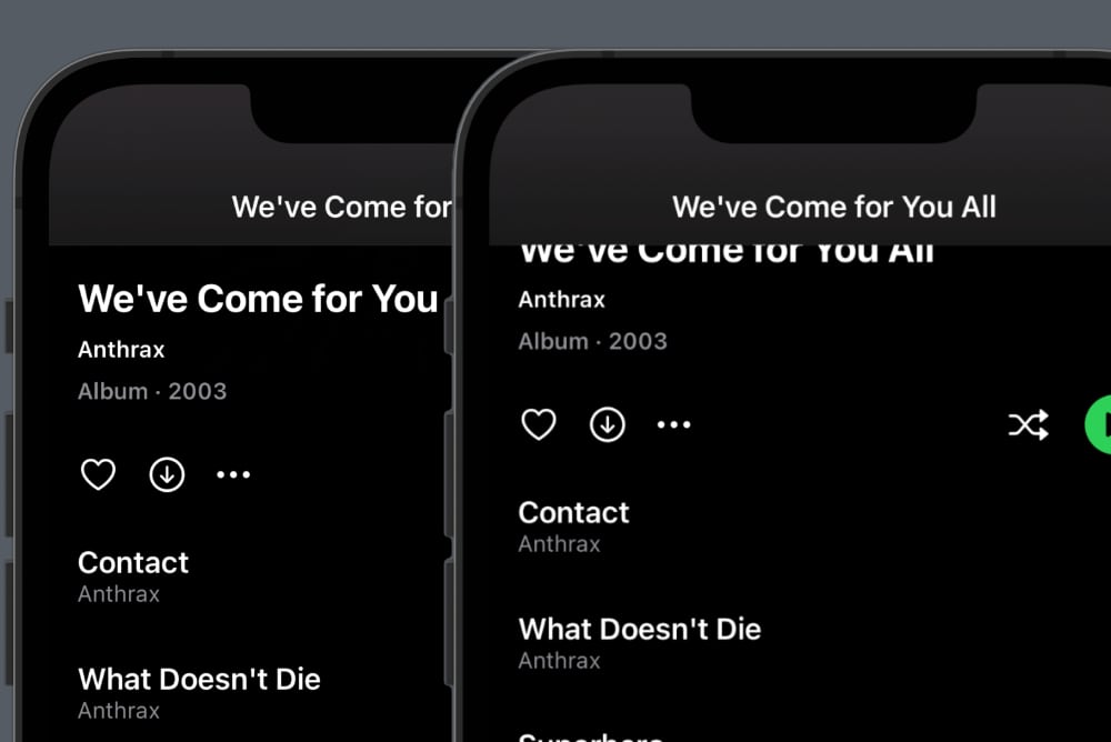
This makes the additional header view height correct, which means that the scrollable title is now visible:
To make the navigation bar transparent, we can use the new toolbarBackground view modifier, which is available in iOS 16 and later:
public struct ScrollViewWithStickyHeader<Header: View, Content: View>: View {

    ...

    public var body: some View {
        ZStack(alignment: .top) {
            scrollView
            navbarOverlay
                .ignoresSafeArea(edges: .top)
                .frame(minHeight: headerMinHeight)
        }
        #if os(iOS)
        .toolbarBackground(.hidden)     // <- Added
        .navigationBarTitleDisplayMode(.inline)
        #endif
    }
}
This makes the navigation bar transparent, which means that the additional header is now visible, which you can tell by the purple gradient:
You may also notice that the navbar title uses a different font. This is because the screen replaces the default title with a custom one that fades in as the header is scrolled away:
scrollView
    .toolbar {
        ToolbarItem(placement: .principal) {
            Text("We've Come for You All")
                .font(.headline.bold())
                .opacity(1-headerVisibleRatio)
        }
    }
And that’s basically all you need to create a sticky header. This is how the screen now looks and behaves when it’s pulled down and scrolled:
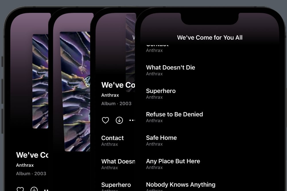
If you look closely, you can see that the cover scales up when we pull down, since we get more vertical space for the header content.
We’ve also applied a fun little tilt effect that causes the cover to rotate around the x axis as the visible ration grows above 1.
Finally, you can see that the cover has a parallax effect that cause it to be overlapped by the scrollable content.
Hooray - we have a fully functional sticky header! However, to make it easier to adjust the content when we scroll, we should make it provide more information to the scroll action.
Let’s modify the ScrollAction typealias to also include the header visible ratio:
public typealias ScrollAction = (
    _ offset: CGPoint,
    _ headerVisibleRatio: CGFloat
) -> Void
then adjust the handleScrollOffset to include the ratio when calling onScroll:
func handleScrollOffset(_ offset: CGPoint) {
    self.scrollOffset = offset
    self.onScroll?(offset, headerVisibleRatio)
}
Having this additional information will make it easier to create certain effects that depend on the header visibility rather than the scroll offset.
Ok, that’s about it! Let’s take a look at the final scroll view code, then wrap up by looking at how to apply fun pull down and parallax effects to the scroll view.
Final code
Although this post became long, the ScrollViewWithStickyHeader code is actually just this:
public struct ScrollViewWithStickyHeader<Header: View, Content: View>: View {

    public init(
        _ axes: Axis.Set = .vertical,
        @ViewBuilder header: @escaping () -> Header,
        headerHeight: CGFloat,
        headerMinHeight: CGFloat? = nil,
        showsIndicators: Bool = true,
        onScroll: ScrollAction? = nil,
        @ViewBuilder content: @escaping () -> Content
    ) {
        self.axes = axes
        self.showsIndicators = showsIndicators
        self.header = header
        self.headerHeight = headerHeight
        self.headerMinHeight = headerMinHeight
        self.onScroll = onScroll
        self.content = content
    }

    private let axes: Axis.Set
    private let showsIndicators: Bool
    private let header: () -> Header
    private let headerHeight: CGFloat
    private let headerMinHeight: CGFloat?
    private let onScroll: ScrollAction?
    private let content: () -> Content

    public typealias ScrollAction = (_ offset: CGPoint, _ headerVisibleRatio: CGFloat) -> Void

    @State
    private var navigationBarHeight: CGFloat = 0

    @State
    private var scrollOffset: CGPoint = .zero

    private var headerVisibleRatio: CGFloat {
        max(0, (headerHeight + scrollOffset.y) / headerHeight)
    }

    public var body: some View {
        ZStack(alignment: .top) {
            scrollView
            navbarOverlay
        }
        .prefersNavigationBarHidden()
        #if os(iOS)
        .navigationBarTitleDisplayMode(.inline)
        #endif
    }
}

private extension ScrollViewWithStickyHeader {

    var headerView: some View {
        header().frame(height: headerHeight)
    }

    @ViewBuilder
    var navbarOverlay: some View {
        if headerVisibleRatio <= 0 {
            Color.clear
                .frame(height: navigationBarHeight)
                .overlay(scrollHeader, alignment: .bottom)
                .ignoresSafeArea(edges: .top)
        }
    }

    var scrollView: some View {
        GeometryReader { proxy in
            ScrollViewWithOffset(onScroll: handleScrollOffset) {
                VStack(spacing: 0) {
                    scrollHeader
                    content()
                }
            }
            .onAppear {
                DispatchQueue.main.async {
                    navigationBarHeight = proxy.safeAreaInsets.top
                }
            }
        }
    }

    var scrollHeader: some View {
        ScrollViewHeader(content: header)
            .frame(height: headerHeight)
    }

    func handleScrollOffset(_ offset: CGPoint) {
        self.scrollOffset = offset
        self.onScroll?(offset, headerVisibleRatio)
    }
}

private extension View {

    @ViewBuilder
    func prefersNavigationBarHidden() -> some View {
        #if os(iOS) || os(macOS)
        if #available(iOS 16.0, macOS 13.0, *) {
            self.toolbarBackground(.hidden)
        } else {
            self
        }
        #else
        self
        #endif
    }
}
Note that .toolbarBackground is only available in iOS 16 and later, so if you target iOS 15 and before, you’d have to use other ways to make it transparent.
How to implement the pull down tilt effect
Most of the cover behavior that we see when pulling down is actually automatically applied by giving the cover an aspect ratio and padding. This is how the cover is created:
var cover: some View {
    AsyncImage(
        url: URL(string: "https://upload.wikimedia.org/wikipedia/en/8/8f/AnthraxWCFYA.jpg"),
        content: { image in
            image.image?.resizable()
                .aspectRatio(contentMode: .fit)
        }
    )
    .aspectRatio(1, contentMode: .fit)
    .cornerRadius(5)
    .shadow(radius: 10)
    .opacity(headerVisibleRatio)
    .padding(.top, 60)
    .padding(.horizontal, 20)
}
We make the cover square by giving it an aspect ratio of 1. The fit content mode makes it stay within its available space, and makes it automatically grow as we pull down.
To implement the tilt effect, we just have to use the headerVisibleRatio. Greater than 1 means we are pulling down, at which we can apply a rotation3DEffect around the x-axis.
We determine the number of degrees like this:
var rotationDegrees: CGFloat {
    guard headerVisibleRatio > 1 else { return 0 }
    let value = 20.0 * (1 - headerVisibleRatio)
    return value.capped(to: -5...0)
}
And apply it like this:
var cover: some View {
    AsyncImage(
        url: URL(string: "https://upload.wikimedia.org/wikipedia/en/8/8f/AnthraxWCFYA.jpg"),
        content: { image in
            image.image?.resizable()
                .aspectRatio(contentMode: .fit)
        }
    )
    .aspectRatio(1, contentMode: .fit)
    .cornerRadius(5)
    .shadow(radius: 10)
    .rotation3DEffect(.degrees(rotationDegrees), axis: (x: 1, y: 0, z: 0))  // <-- Here
    .opacity(headerVisibleRatio)
    .padding(.top, 60)
    .padding(.horizontal, 20)
}
You now get a subtle, but very nice tilt effect when you pull down. To me, this makes all the difference in making the pull down effect playful and enjoyable:

Next, let’s look at how to implement the parallax effect that cause the cover to slide below the content.
How to implement the parallax effect
The parallax effect is similar to the tilt. We just have to check that the headerVisibleRatio is less than 1 which means that we are scrolling, then apply an x offset.
We determine the offset like this:
var verticalOffset: CGFloat {
    guard headerVisibleRatio < 1 else { return 0 }
    return 70.0 * (1 - headerVisibleRatio)
}
And apply it like this:
var cover: some View {
    AsyncImage(
        url: URL(string: "https://upload.wikimedia.org/wikipedia/en/8/8f/AnthraxWCFYA.jpg"),
        content: { image in
            image.image?.resizable()
                .aspectRatio(contentMode: .fit)
        }
    )
    .aspectRatio(1, contentMode: .fit)
    .cornerRadius(5)
    .shadow(radius: 10)
    .rotation3DEffect(.degrees(rotationDegrees), axis: (x: 1, y: 0, z: 0))
    .offset(y: verticalOffset)    // <-- Here
    .opacity(headerVisibleRatio)
    .padding(.top, 60)
    .padding(.horizontal, 20)
}
You now get a subtle parallax effect when you scroll (here with trackpad induced pauses):

Some additional details is the opacity modifier that causes the cover to fade out. You may also notice how the title also fades in the more we scroll.
Conclusion
The ScrollViewWithStickyHeader in this post lets you create sticky scroll view headers by just providing a custom header and a header height.
The scroll view will continuously provide you with the scroll offset and visible header ratio as you scroll, which you can use to create amazing scroll effects.
I have added this view to my newly released ScrollKit library. You can find the source code here. If you give it a try, I’d love to hear what you think.
Big thanks to Daniel Arden for joining my efforts to extend the native SwiftUI ScrollView with these great features.
Discussions & More
If you found this interesting, please share your thoughts on Bluesky and Mastodon. Make sure to follow to be notified when new content is published.