Introducing PickerKit for SwiftUI
Jun 10, 2025 ·
Say hi to PickerKit - an open-source SwiftUI package that contains various image pickers, cameras, document scanners, file pickers, picker utilities, etc. for your everyday picker needs.

Available Features
The first PickerKit beta was just released, but already has many pickers and picker-related views:
Cameracan be used to take photos and handle them as images.ColorPickerBaradds a color picker to a horizontal or vertical bar with additional colors.DocumentScannercan be used to scan documents and handle them as images.FilePickercan be used to pick any file from the Files app.ImagePickercan be used to pick images from the user’s photo library.MultiPickercan be used to pick multiple items in e.g. a list or form.
There are also models and utilities, like the OptionalBinding and CancellableResult models.
Camera
The Camera picker uses the ImagePicker with a .camera picker configuration, and can take pictures with the device camera:
Camera(
    isPresented: $isPickerPresented,
    action: { result in
        switch result {
        case .cancelled: break
        case .failure: break
        case .success(let image): // Handle image here...
        }
    }
)
If you provide a value for isPresented, the camera will automatically dismiss itself when it’s done.
DocumentScanner
The DocumentScanner picker wraps a VNDocumentCameraViewController and can scan one or multiple documents with the device camera:
DocumentScanner(
    isPresented: $isPickerPresented,
    action: { result in
        switch result {
        case .cancelled: break
        case .failure: break
        case .success(let scan): // Handle scan here...
        }
    }
)
If you provide a value for isPresented, the scanner will automatically dismiss itself when it’s done.
FilePicker
The FilePicker picker wraps a UIDocumentPickerViewController and can pick files from Files:
FilePicker(
    documentTypes: [.content],
    isPresented: $isPickerPresented,
    pickerConfig: { picker in
        picker.allowsMultipleSelection = true
    },
    action: { result in
        switch result {
        case .cancelled: break
        case .failure: break
        case .success(let urls): self.urls = urls
        }
    }
)
If you provide a value for isPresented, the picker will automatically dismiss itself when it’s done.
ImagePicker
The ImagePicker picker wraps a UIImagePickerController and can pick images in various ways:
ImagePicker(
    sourceType: .photoLibrary,
    isPresented: $isPickerPresented,
    pickerConfig: { picker in },
    action: { result in
        switch result {
        case .cancelled: break
        case .failure: break
        case .success(let image): images.append(image)
        }
    }
)
If you provide a value for isPresented, the picker will automatically dismiss itself when it’s done.
ColorPickerBar
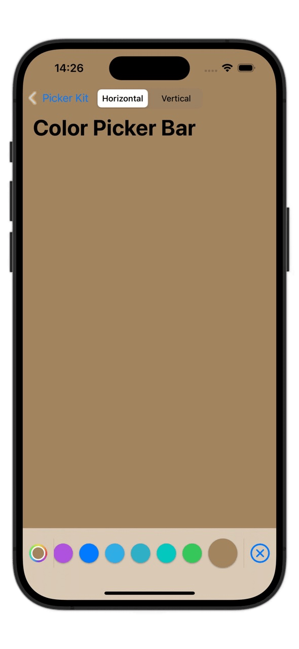
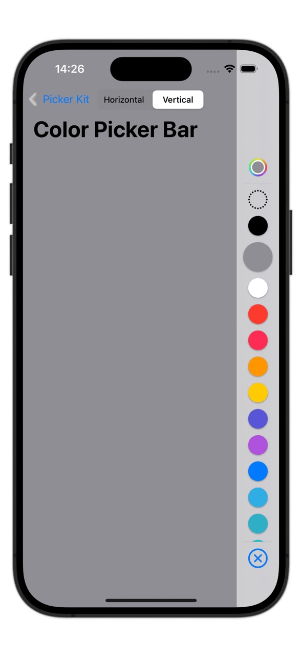
The ColorPickerBar adds a ColorPicker to a horizontal or vertical bar with extra colors and actions:
ColorPickerBar(
    axis: .horizontal,
    value: $color
)
.colorPickerBarConfig(.init(
    barColors: .colorPickerBarColors(withClearColor: true),
    opacity: true,
    resetButton: true,
    resetValue: .black
))
.colorPickerBarStyle(.init(
    animation: .bouncy,
    spacing: 10,
    colorSize: 30,
    selectedColorSize: 45
))
If you provide a value for isPresented, the picker will automatically dismiss itself when it’s done.
MultiPicker
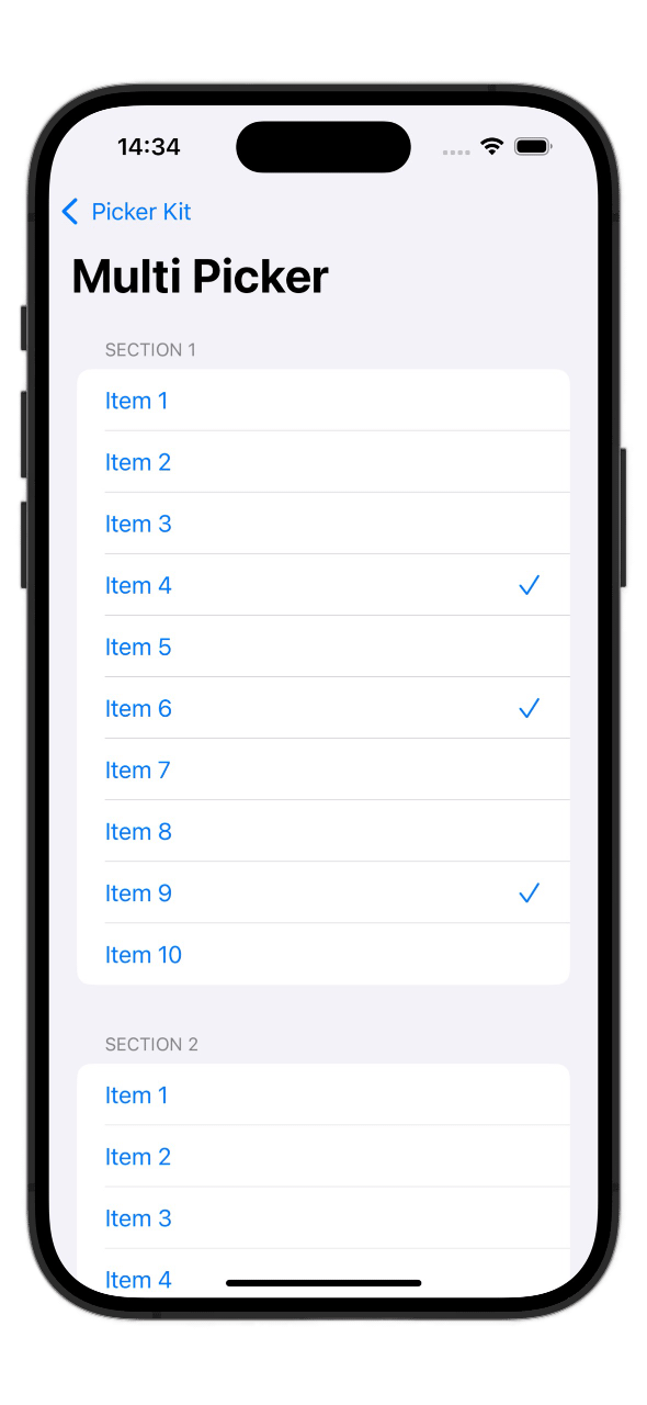
A MultiPicker can be used to pick multiple Identifiable values in a List, Form, stack or grid:
MultiPicker(
    items: items,
    selection: $selection
) { item, isSelected in
    MultiPickerItem(isSelected: isSelected) {
        Text(item.name).tag(item)
    }
}
You can use any custom item view, and wrap it in a MultiItemPickerView to automatically add a checkmark to the selected values.
Discussions & More
If you found this interesting, please share your thoughts on Bluesky and Mastodon. Make sure to follow to be notified when new content is published.