Creating a SwiftUI text view with tappable links
Dec 18, 2024 ·
In this post, we’ll take a look at how to create a SwiftUI Text alternative that can mix plain text and tappable links, using the Text view’s underlying support for Markdown.
Background
When I created a first variant of this component a few years back, I built upon this article by Emma K Alexandra, but it stopped working when using strict concurrency in Xcode 16.2.
As such, I have rewritten it in a more basic way, using the Markdown capabilities of Text that were added after Emma’s post was written.
The result in this post is less powerful, but a lot cleaner. As a bonus, it also works on all platforms.
Text Concatenation
My first approach was to use Text concatenation to implement this, which lets us combine multiple Text views to create a composite view:
Text("Hello, ") + Text("world!").foregroundStyle(.green)
While this is a very powerful feature, it has its limitation. Each component must be a Text, and can only apply view modifiers that generate a new Text.
This means that we can’t use most of the many view modifiers that SwiftUI provides. We can e.g. not use .onTapGesture to apply a tap action, nor wrap a component in e.g. a Button.
Since our goal is to combine text with tappable links, we can therefore not use this clean approach.
Markdown
Since the Text view supports Markdown, we could just provide it with markdown formatted strings:
Text("Hello, [world](https://danielsaidi.com)!")
This approach is very powerful, since we can apply a .foregroundStyle(...) modifier to change text color and .tint(...) modifier to change link color. We can also use most of the Markdown syntax.
For instance, this would make the link bold:
Text("Hello, **[world](https://danielsaidi.com)**!")
While this is very powerful, it’s not that Swifty. Although I would still recommend it for most cases, let’s look at a way to use Markdown without exposing the syntax at the call site.
Creating a Markdown powered, custom view
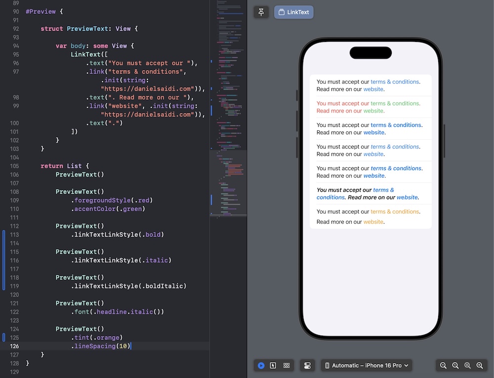
Let’s create a custom LinkText view to provide a Swiftier way to implement Markdown-powered text. It uses LinkText.Component values to define its content, and a LinkText.Style to style its links:
public struct LinkText: View {

    public init(_ components: [Component]) {
        self.components = components
    }

    public init(_ components: Component...) {
        self.components = components
    }

    private let components: [Component]

    @Environment(\.linkTextLinkStyle)
    private var linkStyle

    public var body: some View {
        // TODO...
    }
}

public extension LinkText {

    enum Component {
        case text(String)
        case link(String, URL?, LinkText.LinkStyle? = nil)
    }
}
Since a Markdown-based Text view supports all native view modifiers, and can style both plain text and links, the LinkText.LinkStyle only has to define the styles that Text can’t define:
public extension LinkText {

    struct LinkStyle {

        public init(
            bold: Bool = false,
            italic: Bool = false
        ) {
            self.bold = bold
            self.italic = italic
        }

        public var bold: Bool
        public var italic: Bool
    }
}
We can also define static value builders to simplify applying the style:
public extension LinkText.LinkStyle {

    static var standard: Self { .init() }
    static var bold: Self { .init(bold: true) }
    static var boldItalic: Self { .init(bold: true, italic: true) }
    static var italic: Self { .init(italic: true) }
}
…and add code that makes it possible to inject the style into the environment (use can use @Entry if you target later platform versions):
public extension View {

    func linkTextLinkStyle(
        _ style: LinkText.LinkStyle
    ) -> some View {
        self.environment(\.linkTextLinkStyle, style)
    }
}

private extension LinkText.LinkStyle {

    struct Key: EnvironmentKey {

        static var defaultValue: LinkText.LinkStyle {
            .standard
        }
    }
}

public extension EnvironmentValues {

    var linkTextLinkStyle: LinkText.LinkStyle {
        get { self [LinkText.LinkStyle.Key.self] }
        set { self [LinkText.LinkStyle.Key.self] = newValue }
    }
}
We can now let LinkText generate a Markdown string from its components. Let’s first define a way for LinkText.Component to generate its own Markdown:
private extension LinkText.Component {

    func markdown(
        _ viewStyle: LinkText.LinkStyle
    ) -> String {
        switch self {
        case .text(let text): text
        case .link(let text, let url, let style):
            "[\(text)](\(url?.absoluteString ?? ""))"
                .markdownBold(if: (style ?? viewStyle).bold)
                .markdownItalic(if: (style ?? viewStyle).italic)
        }
    }
}

private extension String {

    func markdownBold(if condition: Bool) -> String {
        condition ? "**\(self)**" : self
    }

    func markdownItalic(if condition: Bool) -> String {
        condition ? "*\(self)*" : self
    }
}
We can then add a computed markdownString property to the LinkText component:
private extension LinkText {

    var markdownText: LocalizedStringKey {
        .init(stringLiteral: components.map {
            $0.markdown(linkStyle)
        }.joined())
    }
}
…and finally use this property to set up a Text view in the body builder:
public struct LinkText: View {

    public init(_ components: [Component]) {
        self.components = components
    }

    private let components: [Component]

    @Environment(\.linkTextLinkStyle)
    private var linkStyle

    public var body: some View {
        Text(markdownText)
    }
}
That’s it, with this in place, it’s possible to combine many text and link elements, and support both global styling, and ways for each link to provide its own style, if needed.

Conclusion
While the old implementation was a lot more powerful, and supported generating individual views that were completely different, the Markdown approach is a lot cleaner and works on all platforms.
You can grab the complete LinkText implementation from the SwiftUIKit open-source project.
Discussions & More
If you found this interesting, please share your thoughts on Bluesky and Mastodon. Make sure to follow to be notified when new content is published.