Creating a custom label style that tints the label icon
Apr 4, 2024 ·
In this post, we’ll take a look at how to create a SwiftUI LabelStyle that only tints the label icon, while leaving the text element unchanged.
Background
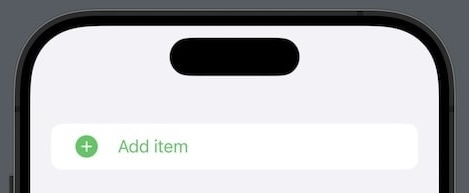
Consider that we have an add Button that wraps a Label, and that we then style it with a symbol variant and tint color to style the icon as a green plus circle:
Button(action: action) {
    Label(
        title: { Text("Add") },
        icon: { Image(systemImageName: "plus") }
    )
}
.symbolVariant(.circle.fill)
.tint(.green)
If we apply a tint color (or foreground style) like this, the entire label content is tinted green:
We could solve this by removing the tint and instead add a green foregroundStyle to the Label icon, but we could also fix it by creating a custom LabelStyle.
How to create a custom label style
We can easily tint the icon of a Label by creating a custom IconTintLabelStyle style:
struct IconTintLabelStyle: LabelStyle {

    init(_ color: Color) {
        self.color = color
    }

    private let color: Color

    func makeBody(
        configuration: Configuration
    ) -> some View {
        Label(
            title: { configuration.title },
            icon: { configuration.icon.foregroundStyle(color) }
        )
    }
}
We can also create a static LabelStyle extension to make it even easier to use this style:
extension LabelStyle where Self == IconTintLabelStyle {

    static func iconTint(_ color: Color) -> Self {
        .init(color)
    }
}
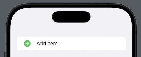
We can now add a labelStyle modifier next to the tint modifier, to apply a tint color to the button and a separate tint color to the icon:
Button(action: action) {
    Label(
        title: { Text("Add") },
        icon: { Image(systemImageName: "plus") }
    )
}
.symbolVariant(.circle.fill)
.tint(.primary)
.labelStyle(.iconTint(.green))
Since a foregroundStyle is applied to the icon by the label style, the order of the modifiers doesn’t matter. The primary tint color is applied to the button and the green to the icon.
Using a custom style like this instead of applying a foreground style to the icon view scales better, and results in cleaner code.
Discussions & More
If you found this interesting, please share your thoughts on Bluesky and Mastodon. Make sure to follow to be notified when new content is published.