SwiftUI Menu gets incorrect list separator lines
Aug 25, 2023 ·
If you’ved added a SwiftUI Menu with an icon Label to a List, you may have noticed that the separator line behaves unlike other items, and starts below the icon instead of the title.
Let’s find a way to fix this.
I noticed this strange behavior in an app of mine, as I moved a couple of menu options into a “Contact Us” Menu to clean up the main menu list:
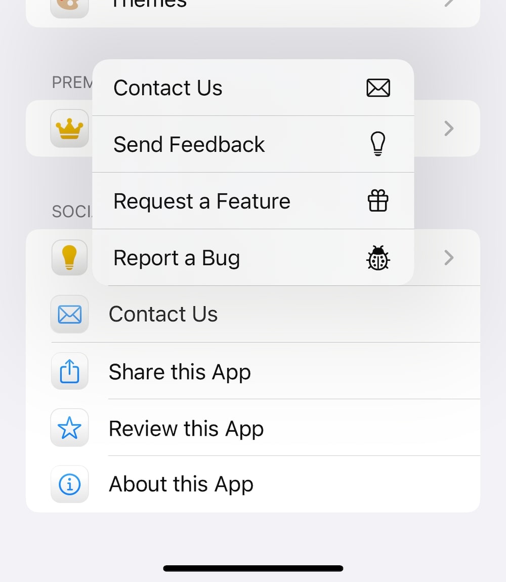
As you can see in the image above, the menu’s separator line starts below the icon instead of below the title. This is unlike how other list items behave.
If we add a DisclosureGroup with the same label, we can see that the separator line works:
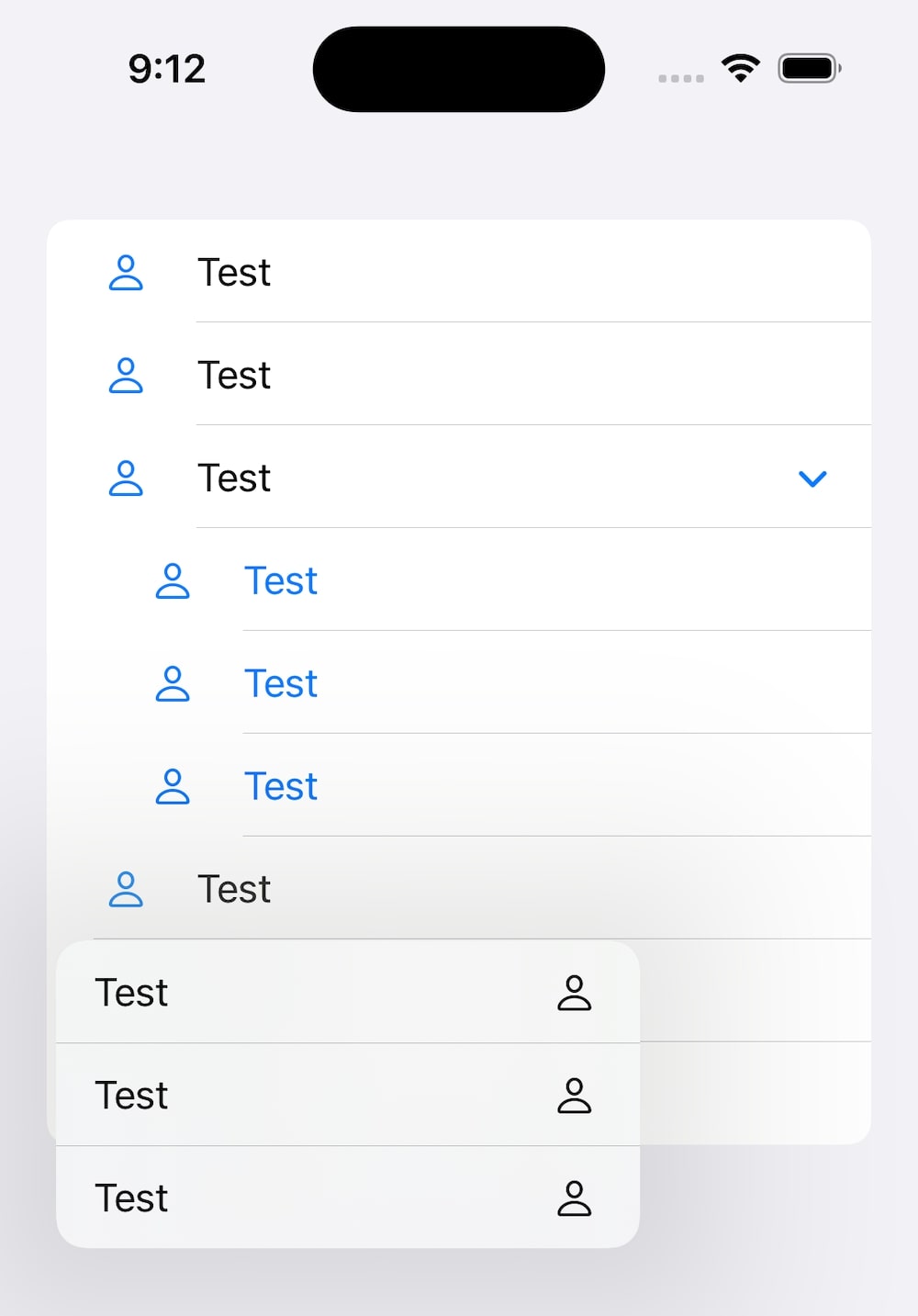
I tried adjusting the separator insets, using alignment guides etc., but nothing worked. Or, alignment guides technically worked, but only when specifying a width, which I don’t want.
The solution - using a custom menu style
After some discussions on Twitter and Mastodon, @JimmyDev suggested something that actually works - using a custom menu style.
If we use Jimmy’s code from the link above, and move the icon argument from the menu initializer to the style, the separator line now starts below the title, just like the other ones:
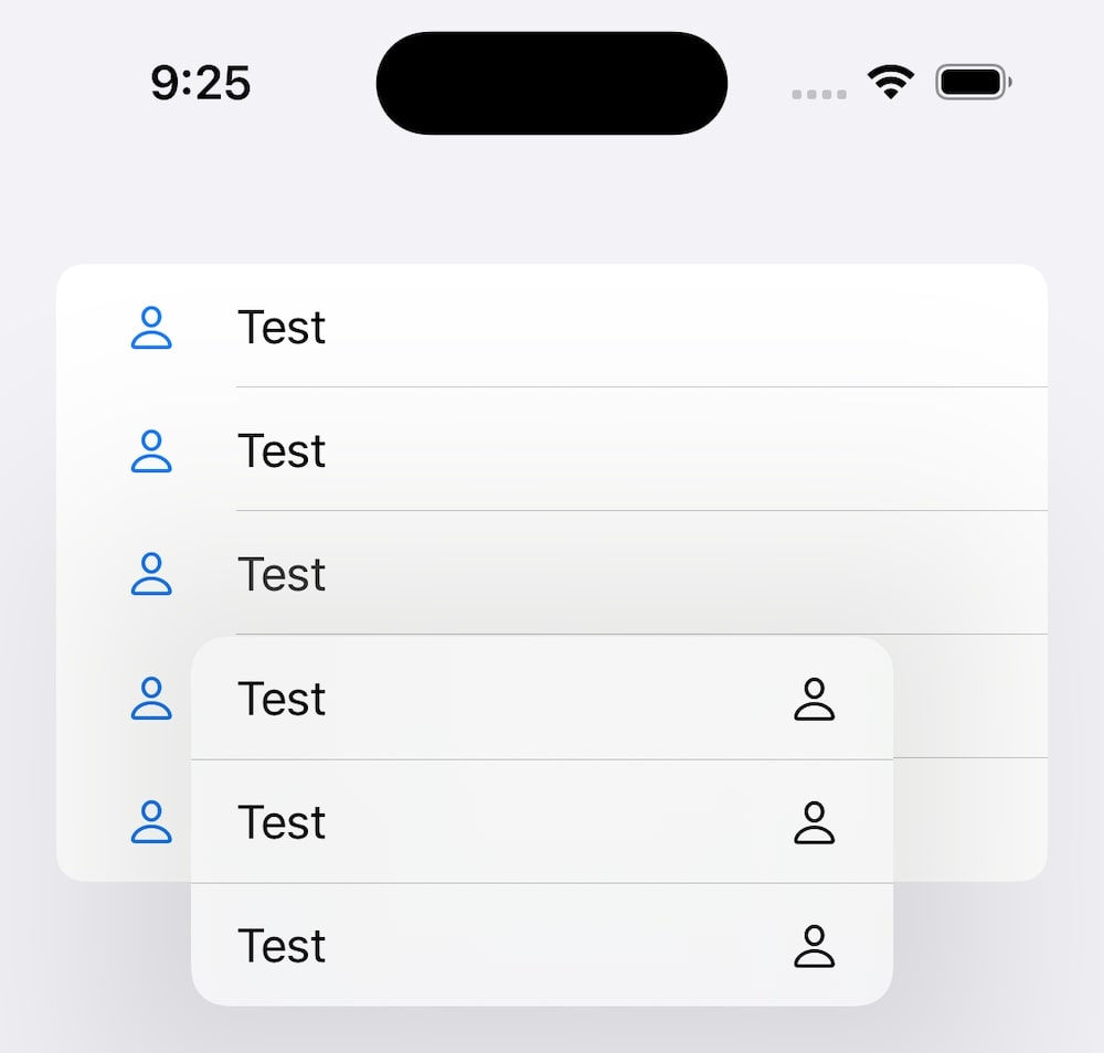
Jimmy, what a genius! We can adjust his code to support generic views as well, to make it more versatile:
struct ListMenuStyle<Icon: View>: MenuStyle {

    init(_ icon: Icon) {
        self.icon = icon
    }

    private let icon: Icon

    func makeBody(configuration: Configuration) -> some View {
        Label {
            Menu(configuration)
        } icon: {
            icon
        }
    }
}

extension MenuStyle where Self == ListMenuStyle<Image> {

    static func list(systemImageName: String) -> some MenuStyle {
        ListMenuStyle(
            Image(systemName: systemImageName)
        )
    }

    static func list(icon: Image) -> some MenuStyle {
        ListMenuStyle(icon)
    }
}
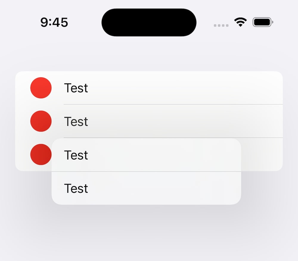
Let’s try this out by applying the menu style to a text-only menu, using a red circle as icon:
struct ContentView: View {

    var body: some View {
        List {
            button

            Menu("Test") {
                button
                button
            }
            .menuStyle(list(icon))

            button
        }
        .buttonStyle(.plain)
    }

    var button: some View {
        Button {
            print("Tapped")
        } label: {
            Label {
                Text("Test")
            } icon: {
                icon
            }
        }
    }

    var icon: some View {
        Circle().fill(.red)
    }
}
If we run this, we can see it works great, although it would be nice to be able to apply it like the button style. But since the menu style defined the icon, that’s not possible:
I have yet to find out how to make a convenience .list builder for the generic view, but it should just involve finding the correct generic constraint to apply to the extension.
When using this menu style, keep in mind that you must only use a text title for the menu. If you apply a label with an icon, the entire label will be used and start at the separator line:
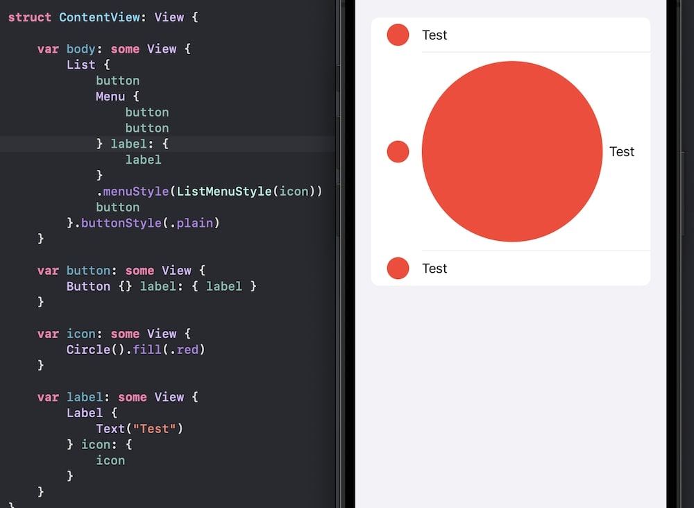
However, if we just stick with a text title and the menu style, things seems to work great.
Thanks a bunch to @JimmyDev for finding a workaround to this strange behavior that I think should be considered a SwiftUI bug.
Conclusion
After playing with this some more, I think I will use a DisclosureGroup instead of a Menu in my apps, since it uses an arrow indicator that I find works better.
Discussions & More
If you found this interesting, please share your thoughts on Bluesky and Mastodon. Make sure to follow to be notified when new content is published.