Creating a bordered button group in SwiftUI
Jun 1, 2023 ·
Just like how SwiftUI buttons can use a .bordered button style, you can use ControlGroup to group several buttons together in a bordered group.
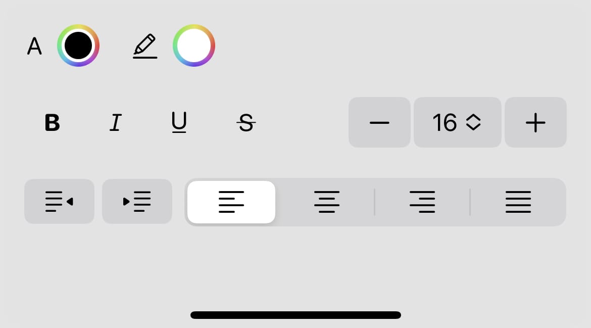
As an example, consider this rich text control panel, where the bottom row has two buttons to affect the text indentation level, as well as a segmented picker to change text alignment:

The buttons use a .bordered style, which makes them not as tall as the picker. I think it would be nicer if the buttons and picker aligned better, and to group the buttons together.
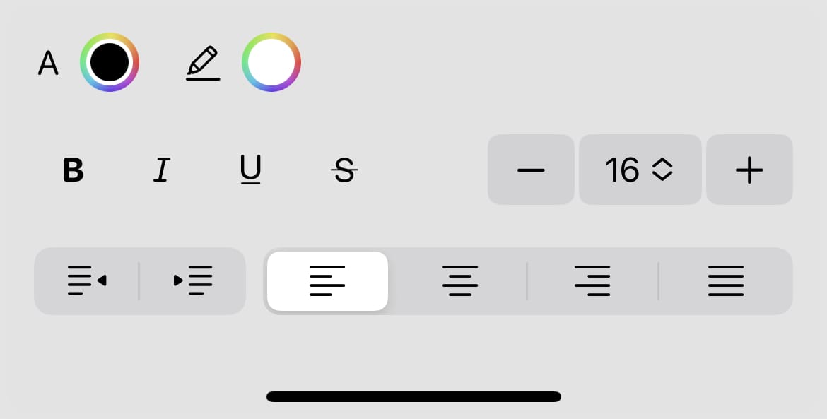
To fix this, you can wrap the buttons in a ControlGroup to make them look just like the segmented text alignment picker:
ControlGroup {
    Button("1") {}
    Button("2") {}
}
Since the control group is greedy, it will take up as much horizontal space as it can. If you don’t want this greedy behavior, you can just add a frame(width:) to the group.
We can now group the indentation buttons together, to align with the segmented picker:

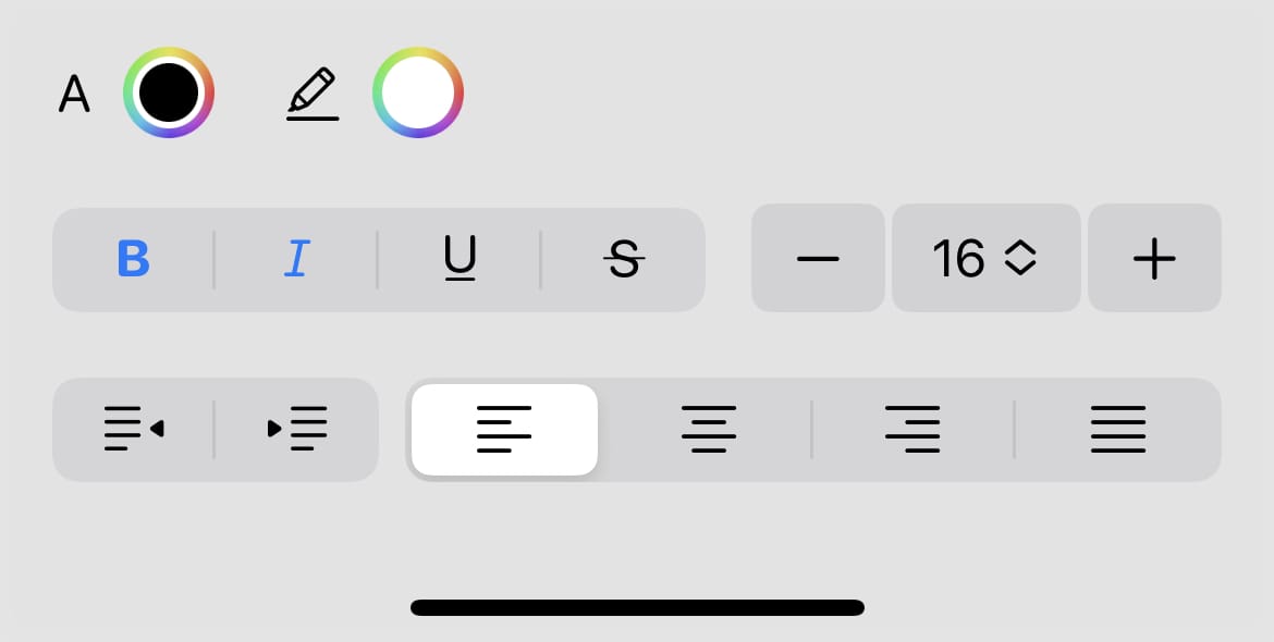
If we want to take this even further, we can also group the style buttons on the second row:

I think that this grouping much clearer indicates which buttons that belong together.
Discussions & More
If you found this interesting, please share your thoughts on Bluesky and Mastodon. Make sure to follow to be notified when new content is published.