Getting started with the SwiftUI NavigationSplitView
Aug 8, 2022 ·
SwiftUI 4 adds a new NavigationSplitView component that simplifies creating rich sidebar-based experiences on iPad and macOS, while scaling it down on iPhone. Let’s take a look!
Since NavigationSplitView requires some setup that is easy to overlook, this post will do some intentional trial and error, where we first fail, then discuss why it fails before fixing it.
Creating a navigation split view
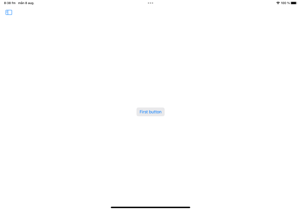
To serve as a base for the examples in this post, consider the following example, where we have a navigation split view that links to demo screens that are defined by this enum:
enum DemoScreen: String, Codable {
    case first, second, third

    var title: String {
        rawValue.capitalized
    }
}
Let’s create a NavigationSplitView with a sidebar that links to the various screens, as well as a main detail area that displays the currently selected screen:
struct ContentView: View {

    @State
    private var selection: DemoScreen? = .first

    var body: some View {
        NavigationSplitView {
            sidebarContent
        } detail: {
            detailContent
        }
    }
}
The sidebarContent view is just a List with navigation links to the various screens:
extension ContentView {

    var sidebarContent: some View {
        List {
            link(to: .first)
            link(to: .second)
            link(to: .third)
        }
    }

    func link(to page: DemoScreen) -> some View {
        NavigationLink(value: page) {
            Text(page.title)
        }
    }
}
The detailContent view switches over a selection and displays screen-specific content:
extension ContentView {

    @ViewBuilder
    var detailContent: some View {
        if let selection = selection {
            detailContent(for: selection)
                .buttonStyle(.bordered)
        } else {
            Text("No selection")
        }
    }

    @ViewBuilder
    func detailContent(for screen: DemoScreen) -> some View {
        switch screen {
        case .first: Button("First button") {}
        case .second: Button("Second button") {}
        case .third: Button("Second button") {}
        }
    }
}
Note that we use a .bordered button style to accentuate the button for later examples.
Navigation split view style
If you run this on iPad, it should looks like this when the sidebar is collapsed in landscape:
If you tap the top leading sidebar toggle button, the sidebar may expand as a slideover:
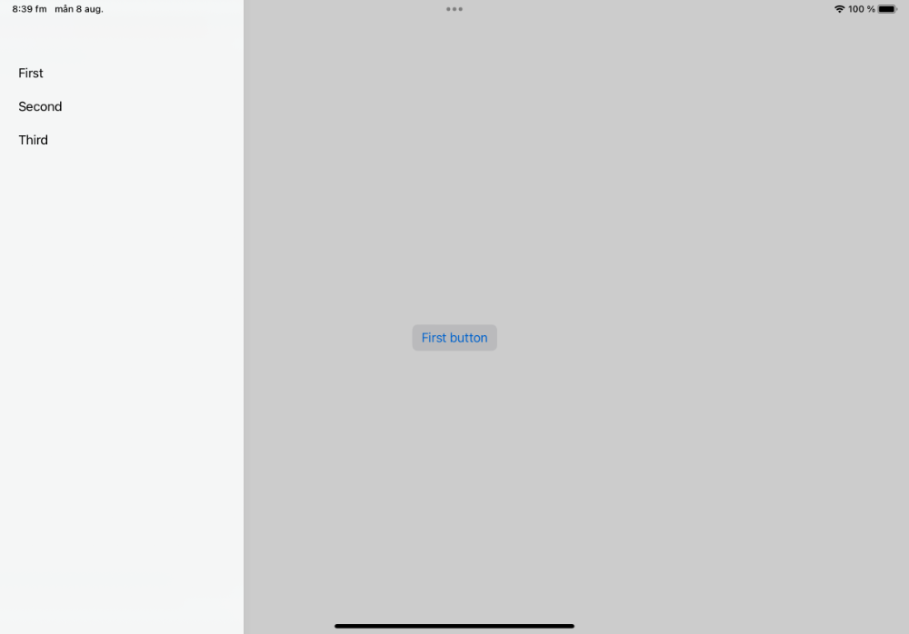
The presentation is however not consistent. For instance, I get a non-slideover randomly. The slideover button will also most often show if the sidebar is expanded on app launch:
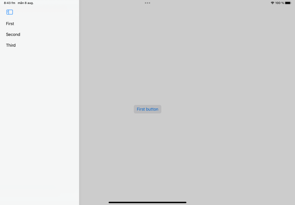
I guess these are just beta bugs, so let’s not focus on them too much. If a slideover is not the style you want, you can change the navigationSplitViewStyle to .balanced:
struct ContentView: View {

    ...

    var body: some View {
        NavigationSplitView {
            sidebarContent
        } detail: {
            detailContent
        }.navigationSplitViewStyle(.balanced)
    }
}
This makes the sidebar push and resize the detail content, instead of sliding in over it:
I really like this style. It also doesn’t suffer from the disappearing button that I mentioned earlier. The style really depends on your use case, though, so just pick the one you like.
Navigation split view selection
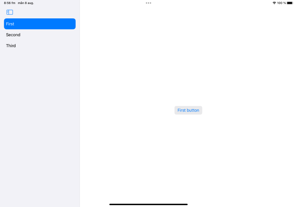
Although the sidebar works, we actually have a pretty serious bug, which you may have noticed in the screenshots. Although we currently have the .firstPage screen selected, it doesn’t highlight in the sidebar. Also, the NavigationLink items don’t render as buttons.
The reason why this happens is one of the subtle NavigationSplitView requirements that are easy to miss and hat can take a long time to track down. Luckily, it’s easy to fix.
While we do keep track of the current sidebar selection as a @State property and display it by switching over it in detailContent, we never bind the selection to the view hierarchy. This means that the navigation split view doesn’t know about the currently selected screen.
To fix this, add a selection parameter to the List that’s rendered by the sidebarContent:
var sidebarContent: some View {
    List(selection: $selection) {
        link(to: .first)
        link(to: .second)
        link(to: .third)
    }
}
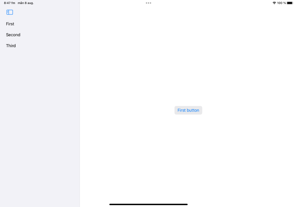
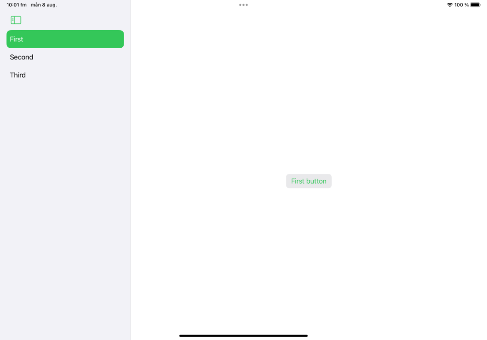
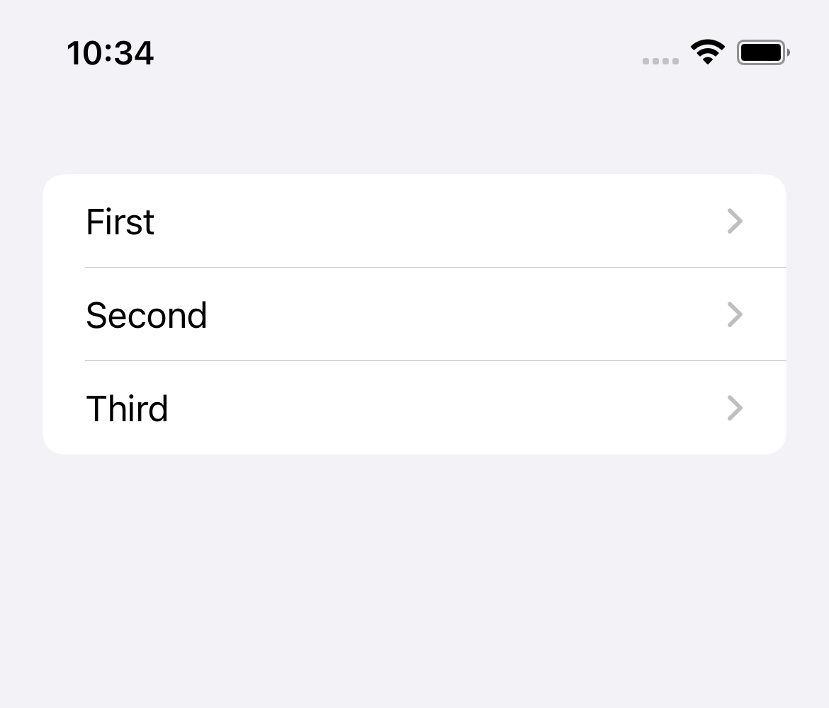
If we run the app again, the sidebar will now render the links as buttons, with the selection being applied to the currently selected screen:
Apple probably have their reasons for designing the API this way, but I think it would have been nice if you could specify the selection directly on the NavigationSplitView and have it automatically applying it to the List.
Styling the NavigationSplitView on iPad
The navigation split view takes its colors from the .accent color, but you can override this by specifying a custom .accentColor:
struct ContentView: View {

    ...

    var body: some View {
        NavigationSplitView {
            sidebarContent
        } detail: {
            detailContent
        }
        .accentColor(.green)
    }
}
As you can see below, this will affect all content, including the sidebar button, the sidebar list, and the detail content buttons:
You can stop the accent color from being used in the detail screen by applying a global tint:
struct ContentView: View {

    ...

    var body: some View {
        NavigationSplitView {
            sidebarContent
        } detail: {
            detailContent
        }
        .tint(.blue)
        .accentColor(.green)
        .navigationSplitViewStyle(.balanced)
    }
}
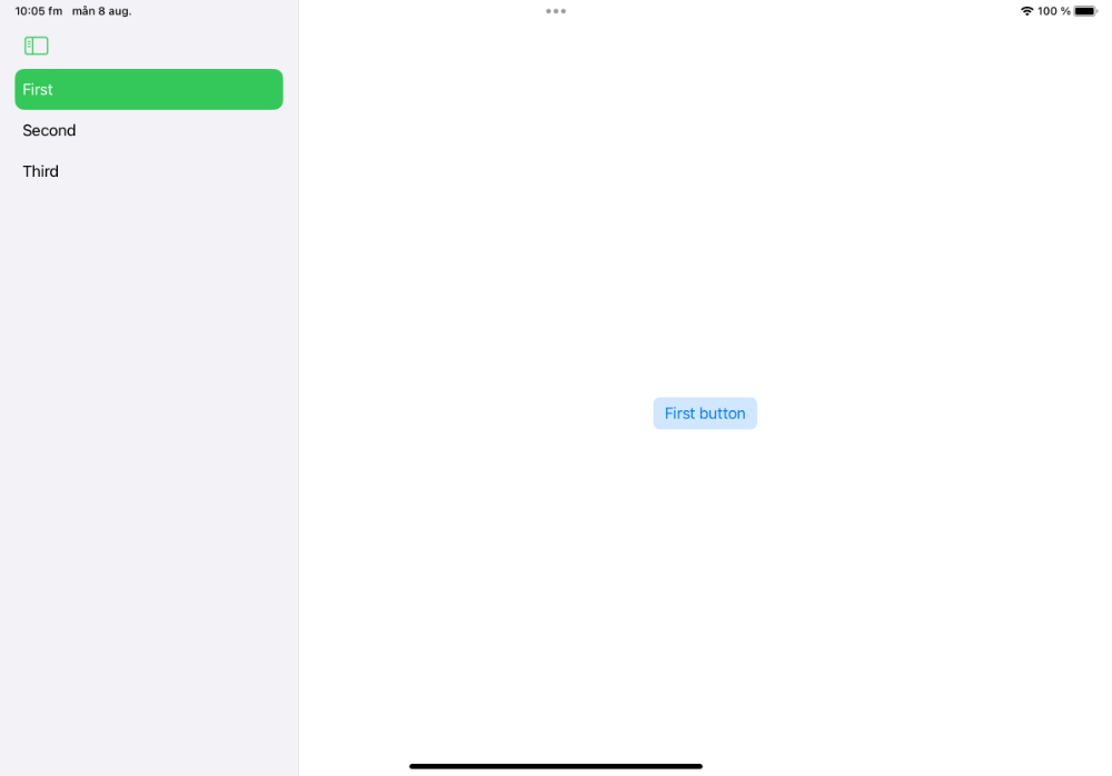
The tint color affects the button more than the accent color, and also tints the background:
You can also reset the accent color on the detail content, instead of specifying a global tint:
struct ContentView: View {

    ...

    var body: some View {
        NavigationSplitView {
            sidebarContent
        } detail: {
            detailContent
                .accentColor(.accentColor)
        }
        .accentColor(.green)
        .navigationSplitViewStyle(.balanced)
    }
}
This applies the accent color to the sidebar, but reset the accent color in the detail content:

If you want to use different accent colors for the sidebar toggle and the sidebar content, you can just apply an separate accent color to the sidebar content:
struct ContentView: View {

    ...

    var body: some View {
        NavigationSplitView {
            sidebarContent
                .accentColor(.purple)
        } detail: {
            detailContent
                .accentColor(.accentColor)
        }
        .accentColor(.green)
        .navigationSplitViewStyle(.balanced)
    }
}
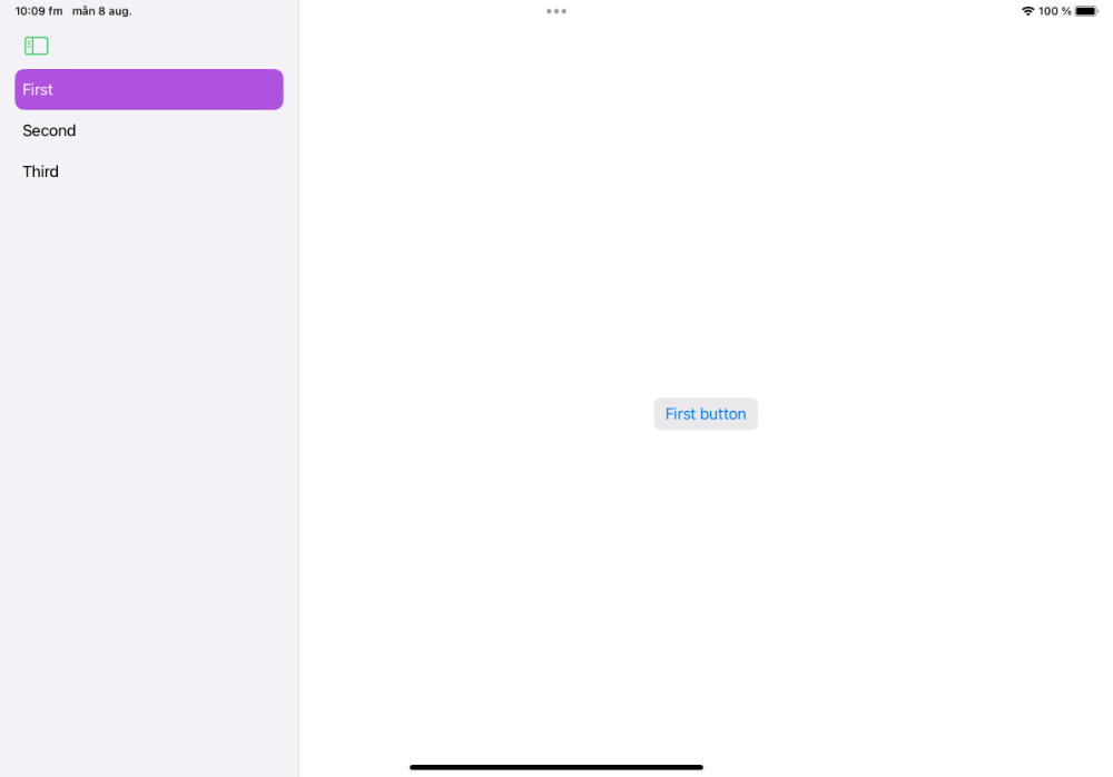
This can be useful if your app requires the button and content to be colored differently, which can make sense even if it looks a bit strange here:
Styling the NavigationSplitView on iPhone
If you run the app on an iPhone, you’ll see how the NavigationSplitView is converted to a NavigationStackView, with the initial selection being pushed by default:
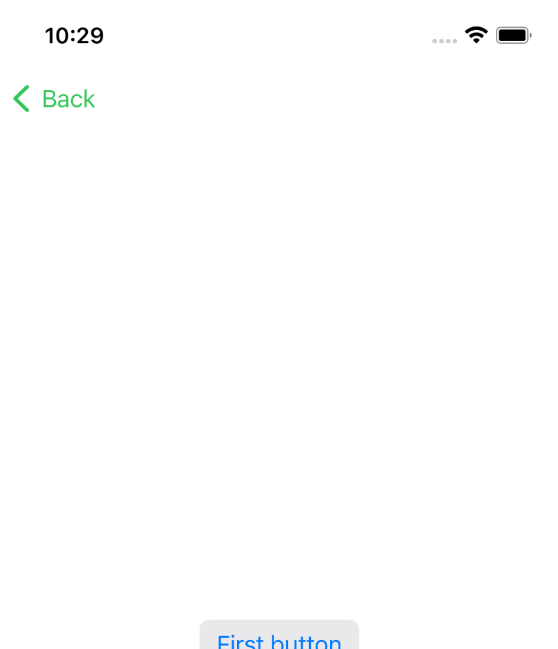
Our custom accent colors are still being applied, with the green color being applied to the back button and the standard color being applied to the detail content button.
However, if you tap “Back” to present the sidebar, you can see that the list is rendered as a plain List instead of using the .sidebar style:
Furthermore, the purple accent color isn’t applied, since the plain list style ignores it. The current selection is also only indicated briefly before being reset.
If you want to style the list on iPhone, you have to use the listRowBackground modifier:
extension ContentView {

    ...

    var sidebarContent: some View {
        List(selection: $selection) {
            link(to: .first)
            link(to: .second)
            link(to: .third)
        }
        .listStyle(.sidebar)
        .listRowBackground(Color.purple)
    }

    ...
}
However, while you can apply custom colors to separate list items, you can’t highlight the currently selected page, since presenting the menu will reset the current selection.
Conclusion
I love the new NavigationSplitView and think the .balanced style is great, although there are some strange api choices and some design limitations.
I’m sure it will be improved over time and think it is a great addition to SwiftUI. Try it out and let me know what you think.
Discussions & More
If you found this interesting, please share your thoughts on Bluesky and Mastodon. Make sure to follow to be notified when new content is published.