SF Symbols 4 variable colors
Jun 17, 2022 ·
SF Symbols is an amazing icon library, designed to integrate seamlessly with the various Apple platforms. SF Symbols 4 adds even more things. Let’s take a look at variable colors!
SF Symbols supports color modes, like .monochrome, .hierarchical, and .multicolor, as well as symbol variants like .fill, .circle, etc.
New this year is .automatic rendering, which defines a preferred rendering mode for each symbol, that is made to fit each symbol’s unique characteristic.
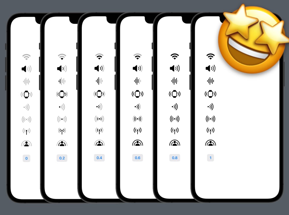
Another new feature this year is variable colors, which make some symbols adaptive to a numeric value. For instance, setting 0.5 to the Wi-Fi symbol colorizes half the beams.
This is great for indicating e.g. signal strength, progress, etc. Symbols may use the value in any way that fits the symbol, or ignore it altogether.
You can easily define a variable value when you create your symbol instance, for instance:
Image(systemName: "wifi", variableValue: 0.5)
This result in a Wi-Fi icon where half the beams are highlighted. Setting the value to 0 will cause all beams to become dimmed, while setting it to 1 will highlight all beams.
Let’s see this in action for multiple symbols at once:
struct Preview: View {

    @State private var value: CGFloat = 0

    func symbol(_ name: String) -> some View {
        Image(systemName: name, variableValue: value)
            .symbolVariant(.fill)
            .font(.largeTitle)
    }

    var body: some View {
        VStack(spacing: 20) {
            symbol("wifi")
            symbol("speaker.wave.3")
            symbol("waveform")
            symbol("applewatch.radiowaves.left.and.right")
            symbol("dot.radiowaves.right")
            symbol("dot.radiowaves.left.and.right")
            symbol("antenna.radiowaves.left.and.right")
            symbol("shareplay")

            Button("\(value.formatted())") {
                withAnimation {
                    if value == 1.0 {
                        value = 0
                    } else {
                        value += 0.2
                    }
                }
            }
            .font(.headline)
            .buttonStyle(.bordered)
            .padding()
        }
    }
}
We start with a value of 0, then increment it with 0.2 each time we tap the button. Each symbol handles the value differently based on its unique characteristics:
Animating changes behaves a big strange at the momebt, where some symbols handle it gracefully and others apply 1 and doesn’t animate. This is hopefully fixed before release.
The feature is doubtlessly an amazing addition to SF Symbols. I can’t wait to use this in my apps, and hope that it makes the case for custom iconography even harder to justify.
Discussions & More
If you found this interesting, please share your thoughts on Bluesky and Mastodon. Make sure to follow to be notified when new content is published.