Using the isEnabled environment value in iOS 14
May 20, 2022 ·
SwiftUI is great, but has a history of buggy behavior. Even if you follow the documentation and your code compiles, you must still verify that it works, especially on older OS versions.
As an example, let’s look at using the isEnabled environment value with button styles.
SwiftUI ButtonStyle can adapt to if the button is enabled or not. Just add an @Environment property that is bound to the \.isEnabled key path, to get whether the view is enabled:
struct MyButtonStyle: ButtonStyle {

    @Environment(\.isEnabled) private var isEnabled

    func makeBody(configuration: Configuration) -> some View {
        configuration.label
            .padding()
            .background(backgroundColor)
            .clipShape(Capsule())
    }

    var backgroundColor: Color {
        isEnabled ? .green : .red
    }
}
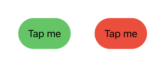
At least, you would think that it’s as simple, since it compiles. In iOS 15, this works great:

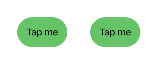
However, it doesn’t work in iOS 14.4, where the isEnabled state always returns true:

Turns out that the environment value returns an incorrect value to button styles in iOS 14. This is another nasty SwiftUI bug that is easy to miss and that causes bugs in your apps.
To fix this bug, your button style must create a nested view, which can then use the correct isEnabled environment value to customize the button content:
struct MyButtonStyle: ButtonStyle {

    private struct ContentView<Content: View>: View {

        var view: Content

        @Environment(\.isEnabled) private var isEnabled

        var body: some View {
            view
                .padding()
                .background(backgroundColor)
                .clipShape(Capsule())
        }

        var backgroundColor: Color {
            isEnabled ? .green : .red
        }
    }

    func makeBody(configuration: Configuration) -> some View {
        ContentView(view: configuration.label)
    }
}
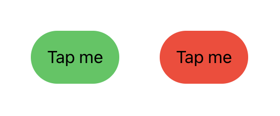
This small adjustment makes the button style render a correct result, even in iOS 14:

If you have many styles, this can become tedious. You can make it more managable by creating a content view that wraps any view and provides it with the correct isEnabled:
public struct ButtonStyleContent<Content: View>: View {

    public init(@ViewBuilder viewBuilder: @escaping ContentBuilder) {
        self.viewBuilder = viewBuilder
    }

    public typealias ContentBuilder = (_ isEnabled: Bool) -> Content

    private let viewBuilder: ContentBuilder

    @Environment(\.isEnabled)
    public var isEnabled: Bool

    public var body: some View {
        viewBuilder(isEnabled)
    }
}
This lets you reduce the amount of code in a style and use the same approach in all styles:
struct MyButtonStyle: ButtonStyle {

    func makeBody(configuration: Configuration) -> some View {
        ButtonStyleContent { isEnabled in
            configuration.label
                .padding()
                .background(backgroundColor(isEnabled: isEnabled))
                .clipShape(Capsule())
        }
    }

    func backgroundColor(isEnabled: Bool) -> Color {
        isEnabled ? .green : .red
    }
}
The content view provides the isEnabled state to the content view builder. You can use it as is or pass it on to any functions that are used to determine the button apperance.
Conclusion
It’s unfortunate that Apple often misses things like this in SwiftUI. Every flaw like this help undermine the trust we developers must have in the technology, to feel confident enough to switch over from UIKit and AppKit.
Furthermore, it’s frustrating that we as developers have to discover these problems and that Apple don’t communicate these flaws. This has not helped the adoption of SwiftUI, where developers constantly argue whether or not the technology is production ready.
But that’s a discussion for another post :)
Discussions & More
If you found this interesting, please share your thoughts on Bluesky and Mastodon. Make sure to follow to be notified when new content is published.