Building a video streaming app for tvOS in SwiftUI
Dec 9, 2020 ·
In this post, let’s see how I created a tvOS app in SwiftUI for the Swedish video streaming service Cineasterna, which lets people watch movies for free with their public library card.
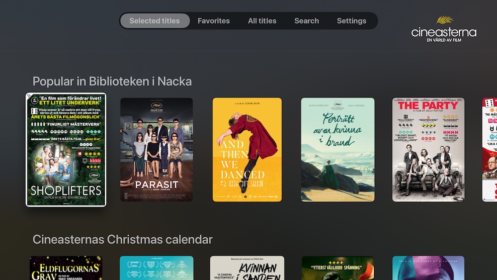
Main tabs
The app is oriented around four main tabs - Discover (Selected Titles), All Titles, Search and Settings. All text in the app is translated using a central localization data source.

When a user is logged in, an additional tab is added to list and manage favorite movies.
Discover
The Discover screen is a vertical list of horizontal shelves, where each shelf title takes the user to that specific list.
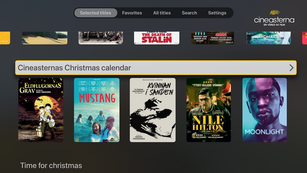
Navigating to a list renders it as a vertical grid. Grids use the same underlying collection as shelves, but with a different layout.
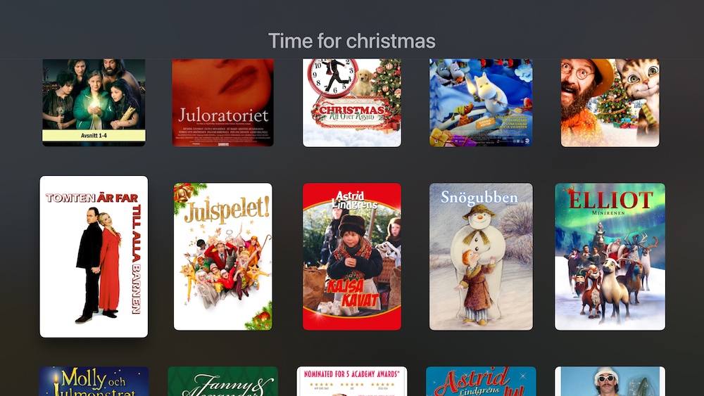
This screen lazy loads more content as the user scrolls down and displays the last content on the page. More about lazy loading later.
Favorites
The Favorites tab only shows up if the user has any favorites. Unlike the Discover screen, the Favorites screen only has a single section and therefore uses a grid instead of shelves.
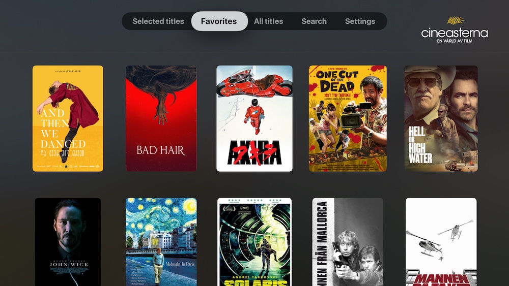
It doesn’t load more content as the user scrolls, since the api returns all favorites at once.
All Titles
The All Titles screen can be used to explore all the movies Cineasterna have to offer. Just like Favorites, it has a single section and therefore uses a grid.
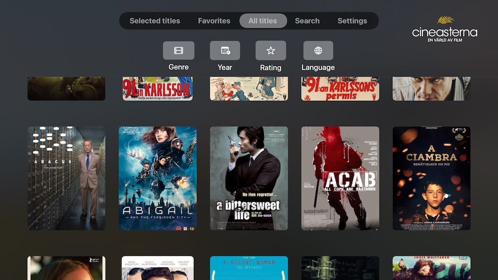
Since Cineasterna has thousands of movies, I added filtering options topmost. Filtering is done in a custom picker, since native SwiftUI pickers didn’t work on tvOS.
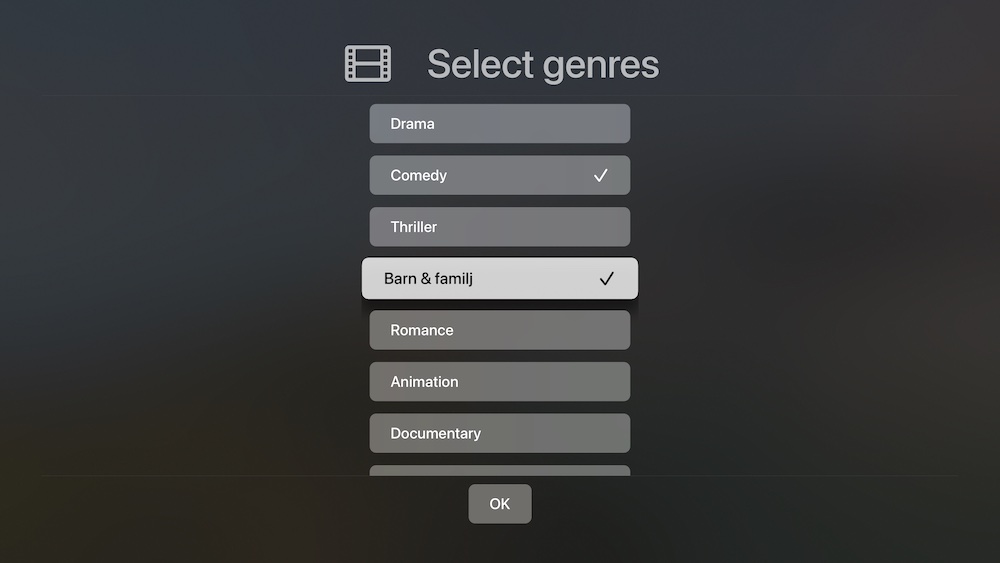
Active filters are tinted with the app’s accent color. Multiple filters can be active at once.
Search
The Search screen can be used to search for movies. Just like Favorites and All Titles, it has a single section and therefore uses a grid.
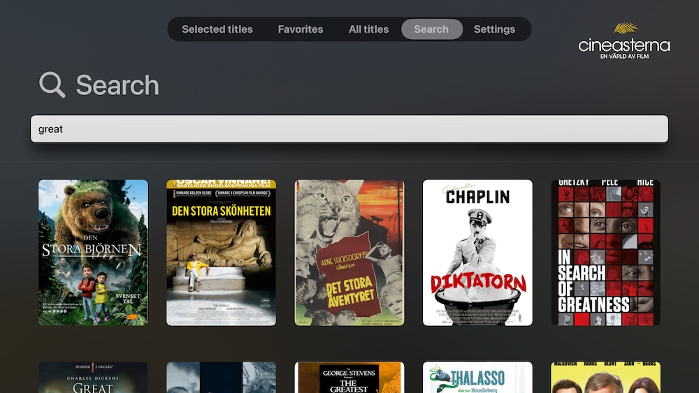
Search has a custom-made header, since there’s no native search component in SwiftUI (yet). This header opens a full screen input and performs a search when tapping ”done”.
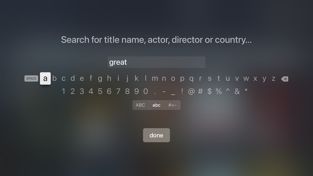
I faced two problems with this. First, dictation inserts invalid chars into the string, so it must be cleaned up. Also, there’s no native way to change “done” to “Search”, without wrapping a native UIKit text field.
Settings
The settings screen is pretty limited in design and functionality so far. It lets the user login, logout, switch library and get more information about the service.
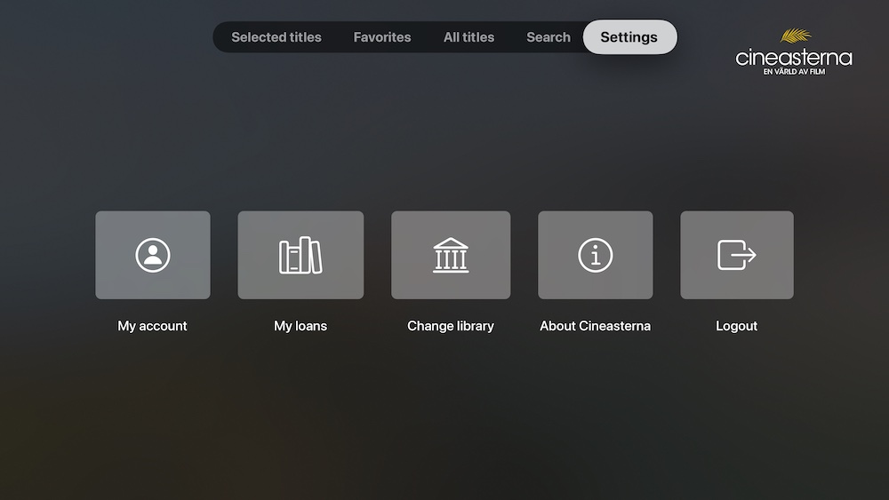
It will have more information and will also have QR codes that lead to support pages, so a user can scan the QR codes on her/his phone to get help.
Movie Screen
The movie screen is clean, with an image background and information added on top of it.
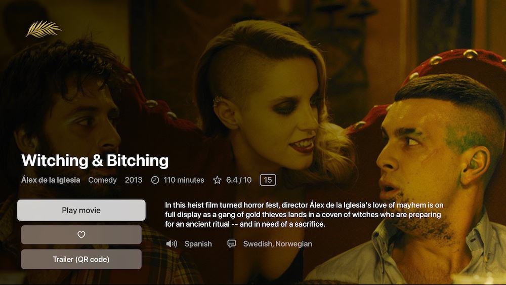
Watching a movie is free and will open a movie player as a new full screen modal. Trailers are currently YouTube links, so they show a scannable QR code:
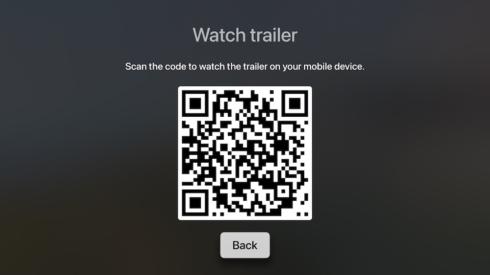
Overall, I like how QR codes can be used to let users explore more content on their mobile device, but it has to be better explained, since users may not be familiar with QR codes.
Technology
Let’s go through some technological aspects of the app as well.
Performance
I first built shelves with LazyVStack and LazyHStacks and grids with LazyVGrid, but scroll performance was horrible. I tried everything and eventually found this great collection view by @defagos, which helped me improve scroll performance.
This collection view wraps a native UICollectionView and uses new collection view APIs like diffable data sources. It works GREAT, has amazing performance and remembers the scroll offset of each section as you return to dequeued sections.
The only drawback with this wrapper is that I have to resize images in a very precise way for them to look good. Also, navigation links don’t work, which probably has to do with the fact that the movie covers are rendered within a hosting controller. I use sheets to fix this.
I have verification from Apple engineers, that scrolling stacks and grids is broken in SwiftUI on tvOS. I just wish they could have mentioned this somewhere.
Async Images
Movie covers are downloaded with Kingfisher, which needed some tweaks to perform well on tvOS. I use a pre-processor to scale images down to exact points and use disk caching.
Since tvOS apps are recycled way less often than iOS apps, you should consider setting a manual cache lifetime limit, to avoid that Kingfisher keeps images around forever.
Lazy Loading
Both shelves and grids can lazy load more content as users scroll down and reach the end of the fetched content. This was easy, by looking at the movie when rendering a list item.
For shelves to trigger a lazy load, the movie must be the first movie in the last available list. For grids, it must be the last movie in the collection.
If so, the view automatically triggers an injected fetch operation and puts more content to the end of the collection. The collection is observed and automatically updates the view.
Video Player
The video player was easy to build, by wrapping an MPPlayerViewController and giving it a url and start position. It remembers the position of each unique movie and restores it the next time that movie is played. Reaching the end resets this position and closes the player.
Conclusion
SwiftUI is amazing, but tvOS support is not good at the moment, and scroll performance is horrible. Many views and APIs are still missing, so you have to wrap UIKit extensively.
Still, this was a very fun project that I’m proud to release. I’m happy to help services like Cineasterna and public libraries help people to discover culture from all over the world.
Discussions & More
If you found this interesting, please share your thoughts on Bluesky and Mastodon. Make sure to follow to be notified when new content is published.