Building a video streaming app for iOS in SwiftUI
Dec 25, 2020 ·
This is a follow-up to this post, where I discussed building a video streaming app for tvOS, using SwiftUI. This post will discuss how I ported the app to iOS.
Throughout the post, I will refer to this as an iOS app, though it targets both iOS & iPadOS.
Project setup
The app is a universal SwiftUI app, which means that it runs on iOS, iPadOS, and macOS. However, due to time constraints, I have not designed it for macOS.
The business logic is kept in a shared library that is pulled in with Swift Package Manager (SPM) into the various apps, which is very convenient.
Since the iOS app supports Chromecast, I had to use CocoaPods to pull in the GoogleCast library as well. This makes the iOS project setup a bit messier than the tvOS project.
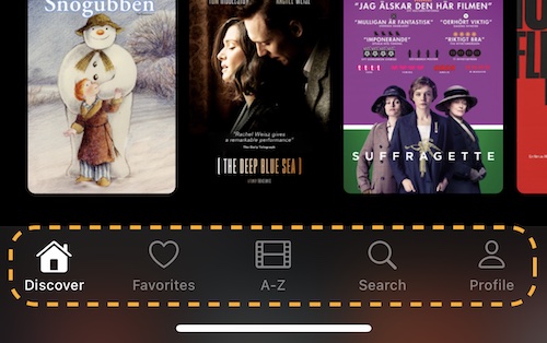
Main tabs
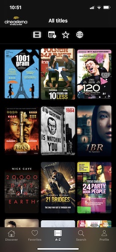
Just like the tvOS app, this app has four main tabs: Discover, All Movies (A-Z), Search and Login (Profile), as well as Favorites for logged in users:
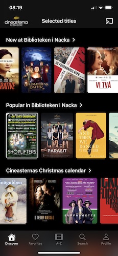
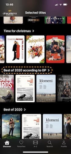
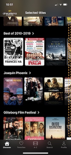
Discover
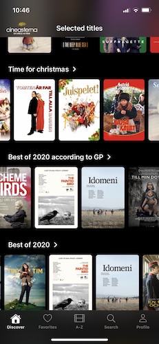
The Discover screen is a vertical list of horizontal “shelves”. It first loads a set of fixed lists for the selected library (news, popular etc.), then loads additional curated “themes”:
This caused me much headache in tvOS, where scrolling had horrible performance and I had to work around that problem by wrapping UICollectionView instead of stacks & grids.
This was not true for iOS, where scroll performance was amazing. I was able to use native stacks and grids without any issues, which saved me a lot of time.
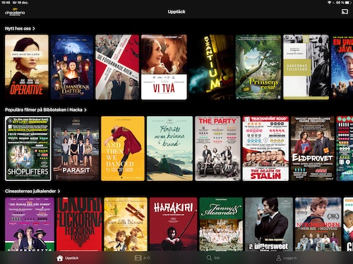
The layout is configured to look good on larger screens as well. This is how the Discover tab looks on a 12.9” iPad Pro in landscape:
Lists & Themes
Shelf sections titles are tappable and takes you to the specific list or theme, using a plain navigation stack push animation:
Lists & themes are rendered as a LazyVGrid, with 3 movies per row on compact devices:
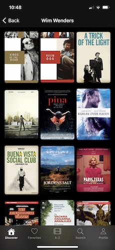
However, 3 movies per row does not look great on larger screens, so I chose a size range that also works great for iPads in both portrait and landscape:
This screen lazily loads more content as the user scrolls down. More on lazy loading later.
Favorites
The Favorites screen tab only shows up if the user has any favorites. Unlike the Discover screen, this list only has a single section and therefore uses a grid instead of shelves.
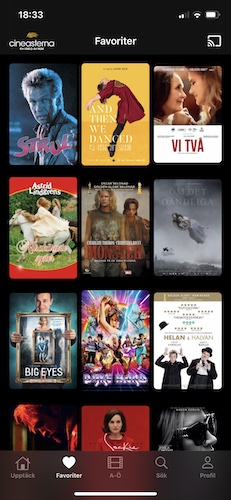
This screen doesn’t load more content on scroll, since the API returns all favorites at once.
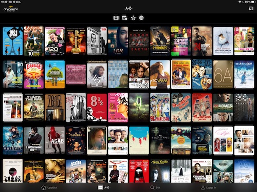
All Movies
The All Movies screen can be used to explore all the movies that Cineasterna has to offer.
The screen has topmost filtering options, that present custom, simple pickers that support optional and multiple selections.
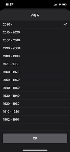
When a filter is active, the filter button is tinted with the app’s accent color. Many filters can be active at the same time.
This screen also loads more content lazily. As we’ll discuss later, shelves and grids handle lazy loading differently.
Search
The Search screen can be used to search for movies. It too has a single section in a grid.
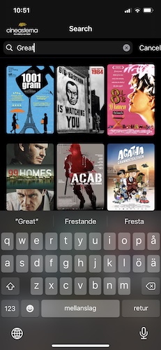
The search bar is custom made and decorates a standard TextField with a wrapped clear button and a trailing cancel button. I’d love a native way to do this instead.
Update 2024 After bumping the deployment target to iOS 15, this app now uses the native .searchable modifier in most places, instead of custom search fields.
Just like ”All Movies”, this screen lazy loads more content as the user scrolls. Performing a new search resets the previous search result as well as pagination.
Settings
The Profile screen is limited in design and functionality. It lets the user login, logout, switch library and get more information about the service, with links to external web pages.
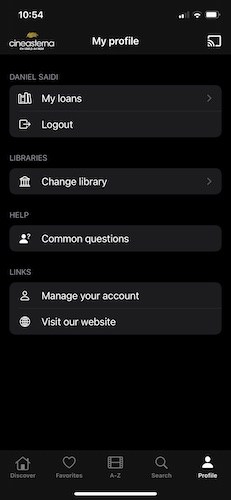
This can be extended with more information and features later on, like support for profiles, more settings & preferences, market switches, etc.
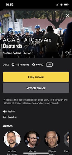
Movie Screen
In all screens until now, users can tap on any movie cover to navigate to the movie screen. Due to its design, with a prominent header, it’s presented in a separate sheet.
The sheet also works great on iPad, where the movie is presented in a centered window:
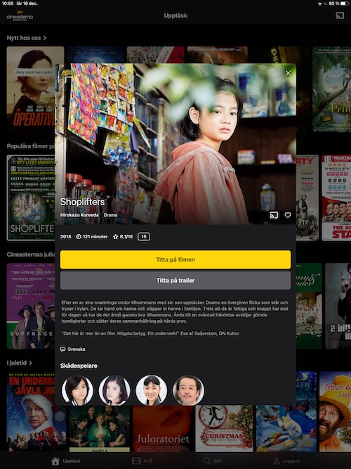
Compared to the tvOS movie screen, I’ve adjusted this screen for mobile device screens.
Instead of a backdrop, the poster image is presented as a header, with the most important info and some action buttons added as overlays. More info is displayed below the header.
The contributor list was easy to build in SwiftUI, using a scrolling HStack and a clip shape.
The video player was reused from the tvOS app and presenting as a fullScreenCover. It stores the time position of each unique movie and restores it the next time that movie is played. Reaching the end resets position and closes the player.
Trailers are currently YouTube links, so they open the YouTube app (if installed) or Safari. I will probably change this to open a Safari sheet instead, to avoid leaving the app.
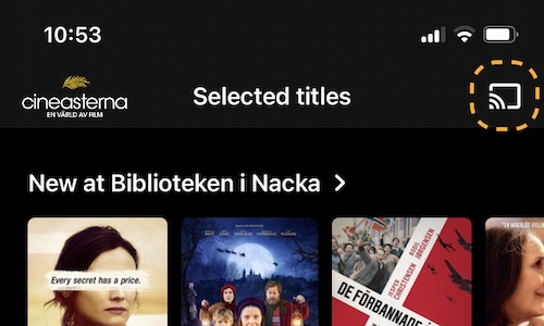
Chromecast
A fun addition to the iOS app was to build Chromecast support with the GoogleCast library. A cast button is presented topmost if a Chromecast device is available on the network.
The Chromecast documentation says that this button should be added to all screens. Well, that’s stupid, but I added it to the movie screen as well.
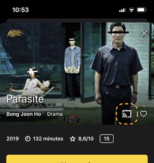
I like that it only appears when there is a Chromecast device on the same network, which means that it only appears when it makes sense.
This was the first time I worked with Chromecast development. I found the docs great, but the sample code nasty, the sample app bad and the overall developer experience lacking.
Technology
Finally, let’s go through some technological aspects of the app and the SwiftUI experience.
Performance
When building the tvOS app, SwiftUI had horrible scrolling performance. This forced me to wrap a UIKit UICollectionView, which took a lot of additional time to get right.
Luckily, scrolling was very performant on iOS & macOS. Performance was never an issue.
Async Images
Just like in tvOS, I use Kingfisher to handle async images. I use a pre-processor to scale images down to exact points, then use disk cache to store them.
I currently have a problem with the disk cache, which I have configured to be valid for 1 day. However, the app never seems to invalidate the cache, so I had to add a workaround.
Lazy Loading More Data
The app can lazily load more content as the user scrolls to the end of the fetched content.
This was easy to achieve, by looking at the movie when rendering a list item. In shelves, a movie triggers a lazy load if it’s first in the last list. In grids, it must be the last movie.
When a lazy load is triggered, the stacks and grids triggers an injected fetch operation. The movie collection is observed and automatically updates the view as new content is added.
Video Player
The video player was easy to build, by wrapping an MPPlayerViewController. It remembers the position of each movie and restores it the next time it is played.
Reaching the end of a movie causes the player to reset the movie position and close itself.
Conclusion
Building this app in SwiftUI for iOS was a lot easier than to build it for tvOS, since scrolling works so much better.
Some native views and APIs are still missing in wiftUI, so you still have to wrap native UIKit components, but not as much as in tvOS.
This was a fun project that I’m proud to release. I love helping services like Cineasterna to let people discover culture from all over the world.
Discussions & More
If you found this interesting, please share your thoughts on Bluesky and Mastodon. Make sure to follow to be notified when new content is published.